4 Introduction to health technology assessment
4.1 Introduction
In this chapter we provide a brief introduction to the principles of health economic evaluation. While we acknowledge that this is a very broad label that can be used to indicate a number of quantitative techniques aimed at analysing data generated in the healthcare context, we consider specifically the situation of health technology assessment (HTA), in which the objective is to determine the value-for-money associated with a given intervention, in comparison to at least another one.
More specifically, to put it with Luce et al. (2010):
Health technology assessment (HTA) is a method of evidence synthesis that considers evidence regarding clinical effectiveness, safety, cost-effectiveness and, when broadly applied, includes social, ethical, and legal aspects of the use of health technologies. The precise balance of these inputs depends on the purpose of each individual HTA. A major use of HTAs is in informing reimbursement and coverage decisions, in which case HTAs should include benefit-harm assessment and economic evaluation.
“Health economics”1 is a relatively young discipline, which has come to the fore in the late 1970s. In particular, since the establishment of the National Institute for Clinical Excellence (later renamed as National Institute for Health and Care Excellence, but commonly still indicated as NICE) by the UK Government in 1997, HTA has firmly become a fundamental part of decision-making in a large number of jurisdictions. NICE has since gained prominence as the global powerhouse for HTA and has been instrumental in developing most of the underlying theoretical underpinning, as well as guidance for practitioners.
Today, the principles of HTA guide healthcare decisions in many countries and agencies such as Canada’s Drug Agency (CDA, originally known as the Canadian Agency for Drugs and Technologies in Health, CADTH), the Zorginstituut Nederland (ZiN; the Dutch agency), the Tandvårds- och läkemedelsförmånsverket (TLV; the Swedish agency), the Scottish Medicine Consortium (SMC) or the All Wales Medicines Strategy Group (AWMSG), to name only a few, who, similarly to NICE in England, are responsible for providing national guidance and advice to improve health and social care. This focuses specifically on advising governments on whether particular healthcare interventions (most notably, pharmaceuticals) should be paid for by the healthcare provider, typically through taxation.
In this chapter, we give some basic definition and notation that is then used throughout the following ones; in particular, we consider the overall structure that is generally associated with HTA.
4.2 Cost-effectiveness analysis
Throughout this book, we almost interchangeably refer to the process of using data to produce an economic evaluation of healthcare interventions as HTA, or health economic evaluation, or cost-effectiveness analysis (CEA). Technically speaking, this is an abuse of the terminology, because, in economic terms, there is a marked distinction between different types of economic analysis (e.g. cost-effectiveness vs cost-utility analysis) and, from the purely economic point of view, conflating these terms is perhaps bad practice – readers should be aware of the nuances in these terms and we refer them to the classic textbooks by Briggs et al. (2006) and Drummond et al. (2015).
Despite this, we also acknowledge that, by and large, the basic process and methodologies applied have several points in common, as we highlight in the following. For this reason, we resist the urge of detailing all the theoretical distinctions in the various economic evaluation methods and provide a unified presentation instead.
Note 4.1: Basic notation for HTA Modelling
Generally speaking, throughout this book we indicate observed or observable variables using Roman letters, e.g. \(y\) or \(x\), typically to indicate a main outcome or some covariate. In the HTA context, the main outcome typically represents effects \(e\) and costs \(c\) (suitably defined, as in the sections below). One of the most important covariate is usually the treatment arm, or the intervention applied to a given group or population. We index this using \(t=1,\ldots,T\).
When we have individual-level data (as in Chapter 5), we index them using \(i=1,\ldots,N\). If the data have a longitudinal nature (e.g. repeated measures over time), we use \(j=0,\ldots,J\) to index the time points at which measurements are taken (as in Table 5.1 and Section 8.5.2), or to describe the time horizon of our analysis (see Chapter 9). In the case of aggregated level data (e.g. Chapter 6), we generally indicate the units of observation as \(s=1,\ldots,S\) (for each “study”).
Occasionally, we slightly abuse this basic notation and change the meaning of a variable or index (e.g. when indicating time to a particular event as \(t\), in Chapter 8). When this is not obvious, we highlight the change specifically.
In particular, in our view, the process of a cost-effectiveness analysis in HTA can be described by a graph such as the one shown in Figure 4.1, which consists of four interconnected building blocks.
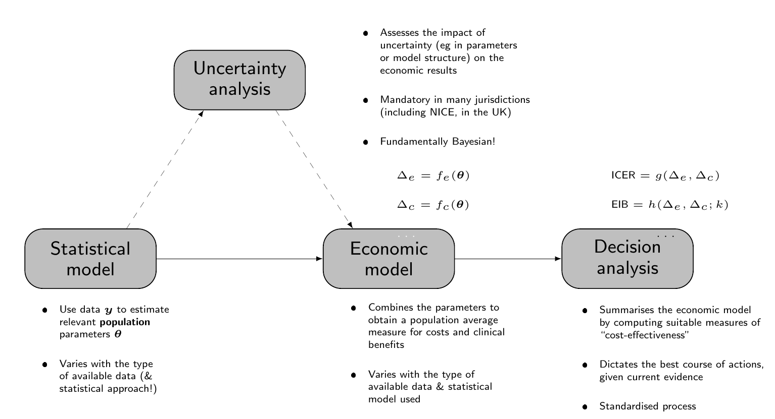
The main building block is represented by the “Statistical model”, which uses observed data \(\boldsymbol{y}\) to obtain estimates of a set of population parameters, say \(\boldsymbol{\theta}\). Generally speaking, the observed outcome is in fact a bivariate quantity, which we generally indicate as \((e,c)\), although the actual nature of the data (and therefore of the model) may vary: for instance, in Chapter 5, we present the case in which individual-level data are available (e.g. alongside a clinical trial), while in Chapter 6 we consider the case in which summary statistics are available, e.g. from a literature review.
As suggested in Note 4.1 above, we assume that \(T\) alternatives are under consideration; typically, \(t=1,2,\ldots,T-1\) are the interventions currently implemented, i.e. the “standard of care” or “status quo”, while \(t=T\) is the new therapeutic option being investigated. For simplicity of exposition, we can consider the case where \(T=2\), but this is not strictly necessary and, in fact, it is recommended that a full economic evaluation does consider all the relevant options.
The output of the statistical model feeds into a second building block, termed the “Economic model” in Figure 4.1, which is used to derive suitable economic quantities for each intervention, that are used to summarise the performance of the competing interventions. More specifically, in an economic context, we are interested in the differential performance of a given intervention against a comparator (typically \(t=1\)). This is generically indicated by the quantities \[ \Delta_e=f_e(\boldsymbol{\theta}) \qquad \text{and} \qquad \Delta_c=f_c(\boldsymbol{\theta}), \] for suitable functions \(f_e(\cdot)\) and \(f_c(\cdot)\). For instance, when performing an economic evaluation alongside a clinical trial, we may obtain the relevant economic summaries directly from the Statistical model – in that case, \(f_e(\cdot)\) and \(f_c(\cdot)\) are the identity functions (see Chapter 5). In more complex situations, however, the output of the Statistical model may be estimates for a set of relevant parameters that need to be processed using highly non-linear and often complex functions to map them back to the scale of the population average benefits and costs (as in Chapters 6 and 7).
Note 4.2: Quality-Adjusted Life Years
Typically, experimental clinical studies set their primary outcome at some hard measure of relative effectiveness: examples include physical measurements (e.g. blood pressure), the incidence of a specific clinical outcome (e.g. cardiovascular failure), or the time until a clinically meaningful event occurs (e.g. time to death). These are obviously relevant and, depending on the specific intervention under study, they allow the clinicians to quantify the actual benefits associated with it.
From a wider decision-making perspective, however, these sorts of outcomes are not necessarily ideal. Firstly, the economic evaluation must be performed to optimise the allocation of resources to the provision of healthcare across the whole range of diseases that are relevant for the target population. Thus, it becomes complex to compare the economic performance of a highly specialised cancer drug (whose main outcome is reduction in cancer mortality) against an innovative form of physiotherapy to relieve from back pain – note that the actual cost-effectiveness analysis would not necessarily compare these two very different interventions against each other, but, eventually, a choice must be made in how to allocate the finite resources and thus it may be rationale to prioritise one over the other as more appropriate to maximise health across the entire target population.
Secondly, hard clinical outcomes may fail to account for both the quantity and the quality of life for a given individual under a particular intervention. This is of course a very relevant aspect, although it may be hard to fully capture. To try and do so, we generally define the measure of “clinical benefit” based on health related quality of life (HRQL) data. These are utility-based scores to value health. Notable examples include the EQ-5D (The EuroQol Group, 1990) and the SF-36 (Ware and Sherbourne, 1992) instruments. Typically, these are obtained through specific questionnaires administered to individuals to map the underlying health state, possibly over time.
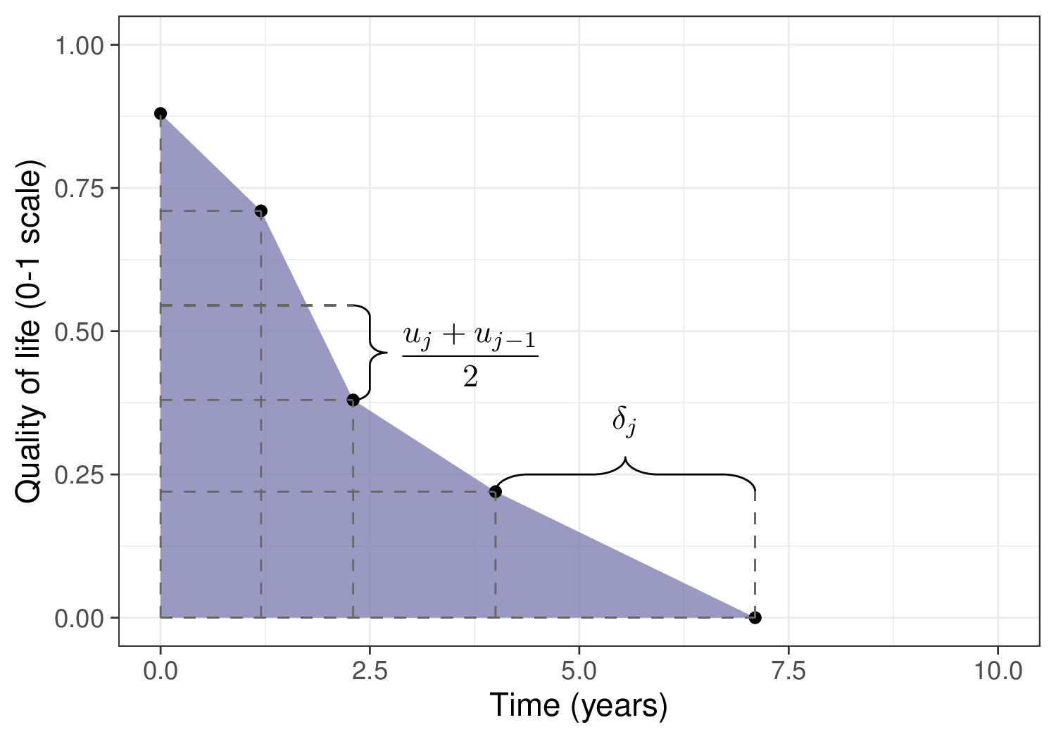
Using these tools, we can assign a utility score to each specific health state and then compute the overall Quality-Adjusted Life Years (QALYs, Loomes and McKenzie, 1989). Figure 4.2 shows this process graphically, highlighting how the QALYs can be considered as the “area under the curve” identified by the HRQL values (on the \(y\)–axis) over a range of measurements (time, on the \(x\)–axis).
Here, the dots represent the value of the utility measured for an individual and generically indicated as \(u_{j}\), at given measurement time points \(j=0,\ldots,J\) – in this fictional case, we assume that at beginning of observation (time \(j=0\)) the measured utility is 0.88. At the next measurement (time \(j=1.2\)), the utility decreases to 0.71 and so on, until it hits 0 at time \(j=7.1\) (end of follow-up).
The quantity \(\delta_j\) indicates the length of interval between two successive measurements. The trapezoids shown in Figure 4.2 encode the assumption that quality of life as measured by the utility score decreases linearly between two consecutive measurements. The overall QALYs are effectively computed as the area under each trapezoid and summed over all of them, to obtain an aggregated measure for the HRQL component \[ \text{QALYs} = \displaystyle\sum_{j=1}^{J} \frac{\left(u_{j}+u_{j-1}\right)}{2} \delta_{j} \tag{4.1}\] – we consider more specifically a worked example for the computation of QALYs starting from individual-level data on HRQL in Chapter 5.
Another useful way to interpret QALYs is by mapping the actual time alive onto an equivalent amount in “perfect health”. In the example above, the individual is alive for 7.1 years during the observation period, but applying Equation 4.1 this is computed to be equivalent to 2.40 years in perfect health.
The main advantage of using QALYs as a standardised measure of clinical benefit, is that they facilitate resource allocation decisions. In addition, through the incorporation of utility values, they allow to reflect the subjective experiences and preferences of individuals regarding their health states.
On the other hand, several ethical objections have been raised against QALYs: the main one is that they implicitly quantify the monetary value of a human life, which is often seen as problematic, in particular because health states are generally evaluated on a scale 0 (= death) to 1 (= perfect health), while allowing for health states that are “worse than death” and are therefore given a negative utility. This is considered unethical and increasingly advised against (Schneider, 2022).
Neumann and Cohen (2018) review other potential advantages and pitfalls of QALYs, including the fact that they tend to prioritise common conditions over rare diseases, but conclude that
Without QALYs, health systems would still have difficult trade-offs. Decision makers would still confront and make difficult choices about paying for the health care that people need and desire. But they would lack a practical instrument to aid in the process.
Irrespective of how we obtain the mapping from the “Statistical model” to the “Economic model”, the quantities \((\Delta_e,\Delta_c)\) are then used to perform the “Decision analysis”, which is aimed at selecting the alternative that offers the largest “value”, both in terms of benefits and costs. There are various suitable metrics that can be defined as functions of the differential benefits and costs, \((\Delta_e,\Delta_c)\), to conduct the decision analysis.
For example, historically, a common summary of the decision-making process has been represented by the Incremental Cost-Effectiveness Ratio (ICER) \[ \begin{aligned} \text{ICER}& = \frac{\text{Population average cost differential}}{\text{Population average effectiveness differential}} \\ & = \frac{\text{E}[c_2]-\text{E}[c_1]}{\text{E}[e_2]-\text{E}[e_1]} = \frac{\text{E}[\Delta_c]}{\text{E}[\Delta_e]}, \end{aligned} \tag{4.2}\] which quantifies the “cost-per-outcome”, or, in other words, the monetary cost that the healthcare provider needs to bear in order to increase the population average benefits by one unit. Here, we generically indicate with \(\text{E}[e_t]\) and \(\text{E}[c_t]\) the intervention-specific population average measures of benefits and costs, respectively.
Given current evidence and assuming that the modelling assumptions are reasonable, the ICER can be used to guide the decision-making process, i.e. to determine whether to switch to the new intervention \(t=2\) or stick with the status quo \(t=1\). In particular, when comparing two interventions, if \(\text{ICER}<0\), then one of two situations occurs:
- \(\text{E}[\Delta_e]>0\) and \(\text{E}[\Delta_c]<0\); in this case, the new intervention is associated with higher benefits and generates savings, in comparison to the status quo. Thus, \(t=2\) dominates \(t=1\) and, given current evidence, it should be selected as the most cost-effective alternative;
- \(\text{E}[\Delta_e]<0\) and \(\text{E}[\Delta_c]>0\); in the opposite situation, the new intervention is more expensive and decreases the population benefits. In this case, \(t=2\) is dominated by \(t=1\) and, given current evidence, it should be rejected, with the status quo maintained as the most cost-effective alternative.
Similarly, when \(\text{ICER}>0\), there are two possibilities:
- If both \(\text{E}[\Delta_e],\text{E}[\Delta_c]<0\), then the new intervention generates monetary savings, but it does so by producing fewer health benefits.
- If both \(\text{E}[\Delta_e],\text{E}[\Delta_c]>0\), then the new interventions improves health, but at an increased cost.
In both these situations, it is more complicated to make a decision based on the value of the ICER, as it is unclear up to what point we can accept an increase in costs to produce more benefits or a decrease in benefits to generate savings that we can re-invest in other interventions.
As a more specific example, consider the comparisons between a reference intervention, say A, and four different comparators: B, C, D and E. These are shown in Figure 4.3, which presents the “cost-effectiveness plane” (Black, 1990), where the \(x-\) and \(y-\)axes describe, respectively, the population effectiveness and cost differentials (we return to this in the discussion of Figure 4.5). In this case, E dominates A, because the corresponding ICER falls in the North-Western quadrant, indicating that A produces, on average, lower benefits and increased costs. On the other hand, A dominates B, C and D because it produces more benefits while saving costs (with all three corresponding ICERs in the South-Eastern quadrant). The greyed areas in Figure 4.3 (the North-Eastern and the South-Western quadrants) indicate the parts of the cost-effectiveness plane in which the decision is undetermined, just by looking at the ICER.
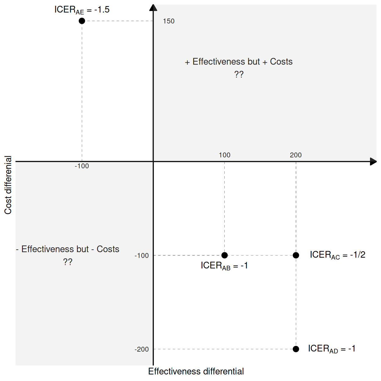
An additional inconsistency of the analysis based on the ICER is that it is not an ordered statistic: in this simple example, we can look at the ICERs and the actual cost and benefit differentials to see that A fares best against D (highest increase in benefits and highest decrease in costs), then against C and finally against B; yet, the ICERs do not respect this ordering, since \(\text{ICER}_{\text{AB}}=-1\), \(\text{ICER}_{\text{AC}}=-1/2\) and \(\text{ICER}_{\text{AD}}=-1\). Moreover, the sign of the ICER is the same for all the comparisons, even though A is dominated by E and dominates the other interventions.
To overcome these limitations of using the ICER as the basic criterion for decision-making, we can use a fully decision-theoretic approach. This is based on defining a utility function to associate with each intervention \(t\) and then determine the most cost-effective alternative as the one maximising the expected utility. In HTA, the standardised choice is for the monetary net benefit (MNB) \[ nb_t = ke_t - c_t \tag{4.3}\] where \(k\) is a “willingness to pay” deterministic parameter, used to place the benefits and costs on the same monetary scale – in other words, \(k\) determines the cost-per-outcome.
NotePros and cons of the monetary net benefit
As suggested above, there is no reason why other utility functions should not be considered in place of the the monetary net benefit, in HTA. Nonetheless, this is effectively an unchallenged choice, basically because of its ease of interpretation (at least at face value) and because of its linearity in \((e,c)\), which means that the computations are simplified – the expected utility is computed with respect to a bivariate quantity, but thanks to linearity the two components can be separated out.
There are some underlying complexities in the use of the MNB: firstly, it assumes that we are willing and able to rescale health benefits in monetary terms. We generally do and accept that we can put a monetary value to, effectively, a human life. This is of course not free from controversy (see for example Donaldson et al., 1997; Friedman, 2021).
In addition, from a more mathematical perspective, we can also prove that the MNB assumes risk-neutrality on the part of the decision-maker, i.e. in other words that \(k\) is all that is needed to put costs and benefits on equal footing – this is most often not the case in real applications, where decision-makers tend to be risk-averse. Baio (2012, sec 3.7.1) discusses the expansion of the utility function to include a risk-aversion parameter (Raiffa, 1968).
For each intervention, we can compute the expected net benefit \[ \mathcal{NB}_t = \text{E}\left[nb_t \right], \] The intervention associated with the highest expected net benefit \(\mathcal{NB}^*=\max_t \mathcal{NB}_t\) is then selected as the most cost-effective.
In the simple case of only two interventions being compared, we can make decisions based on the Expected Incremental Benefit \[ \begin{aligned}[b] \text{EIB}& = \mathcal{NB}_2 - \mathcal{NB}_1 \\ & = \text{E}\left[k e_2 - c_2\right] - \text{E}\left[k e_1 - c_1 \right] \\ & = k\text{E}\left[e_2 - e_1\right] - \text{E}\left[c_2 - c_1 \right] \\ & = k\text{E}\left[\Delta_e \right]- \text{E}\left[\Delta_c \right]. \end{aligned} \tag{4.4}\] Using this metric, \(t=2\) is deemed to be cost-effective if \(\text{EIB}>0\), in which case its expected utility is higher than that of the comparator. Because the value of \(k\) is explicitly considered in the definition of the EIB, there is no confusion over the decision rule. Interestingly, this is equivalent to the case in which \(k>\text{ICER}\) if \(\text{E}\left[\Delta_e\right]>0\) or \(k<\text{ICER}\) if \(\text{E}\left[\Delta_e\right]<0\), as can be seen by simply re-arranging Equation 4.4.
NoteHow they made the threshold
Historically, NICE have usually considered that interventions associated with an \(\text{ICER}\) between £20 000 and £30 000 represent good value for money for the healthcare provider – given the discussion above, this implies a threshold of \(k \in\) [20 000; 30 000]. However, the range of values for the willingness to pay selected by NICE has a long and complicated history.
As mentioned in McCabe et al. (2008), NICE’s official methods guides did not refer to a fixed threshold; nonetheless, Rawlins and Culyer (2004) reported that NICE had up to that point basically always accepted interventions with \(\text{ICER}< \text{£}20000\) and hardly ever recommended those with \(\text{ICER}>\text{£}30000\).
Much to marked disappointment among some members of the original NICE panel, that range has become received wisdom and has often been taken at face value, leading to some heated debates – see for example Claxton et al. (2000) and, more recently, Barnsley et al. (2013) and Claxton et al. (2015), who suggest lower optimal values for \(k\). Sampson et al. (2022) present an econometric analysis of the cost-effectiveness threshold as determined by the supply-side.
Very recently (and with a view for full implementation starting from April 2026), the threshold suggested for use by NICE has been increased to £25 000 and £35 000 (NICE, 2025). This has been justified with the possibility of approving medicines that deliver significant health improvements but might have previously been declined purely on cost-effectiveness grounds, although critics have argued that increases in the price paid by the healthcare provider by raising the threshold is not guaranteed to bring additional benefits for the whole population (notably among others, Claxton and Sculpher, 2025).
NoteThe cost-effectiveness threshold around the world
It is difficult to keep a close record of official values for the “cost-per-QALY” sanctioned in different jurisdictions. This is because not all have formal HTA processes and agencies and even when they do, they may decide to apply more or less rather general rules, sometimes subject to specific exceptions (e.g. in the case of interventions for high-impact disease areas or end-of-life care).
In some cases, the national threshold is, at least informally, set at some equivalent to that suggested by NICE – for instance, while there is no formally pre-specified cost-effectiveness threshold, in Italy interventions are typically evaluated against an informal benchmark of €25 000 to €40 000 per QALY (Russo et al., 2023), which occasionally raises up to €50 000.
Some recent examples of international estimates include Vallejo-Torres et al. (2018), who suggest a range of €22 000 to €25 000 per QALY, in Spain, while separate work by van Baal et al. (2019) and Stadhouders et al. (2019) estimate a cost-per-QALY ranging from €41 000 to €71 600, in the Netherlands. Siverskog and Henriksson (2019) place the threshold at SEK 370 000 (approximately equivalent to €39 000 in 2019 currency) for Sweden, while Vanness et al. (2021) estimate a cost-per-QALY of $104 000, in the US. Finally, Edney et al. (2018) give an estimate of AUD 21 000 to AUD 38 000 for Australia and Ochalek et al. (2020) estimate a range of RMB 28 000 to RMB 52 000 for China.
4.3 Uncertainty analysis
The straight path from the “Statistical model” to the “Decision analysis” in Figure 4.1 represents the decision-making process given current evidence and conditionally on the assumptions made in the statistical analysis. This, however, does not fully account for the inherent uncertainty in the estimates for the model parameters, which in turn determine the economic summaries and therefore have a potentially substantial impact on the uncertainty in the decision-making process. For example, this may be because the relevant data may be obtained from a relatively small clinical trial, possibly with a follow-up that is not long enough to capture potential side effects.
More importantly, the decision is generally not binary, because we could always consider a third option: what if we are not confident in making a decision just yet, because the data are not definitive and thus there remains too much uncertainty? In that case, the optimal decision is in fact to postpone it until we can obtain more data to reduce the current uncertainty and thus be able to make a better one (we return more formally to this point in Chapter 12).
Consequently, the uncertainty underlying decisions over the adoption, implementation or reimbursement of new interventions must also be assessed thoroughly and, crucially, its impact on the decision-making must be formally included in the assessment. For this reason, it is generally mandatory to “take a detour” from the straight path from “Statistical model” to “Decision analysis” through the “Uncertainty analysis” building block, as shown in Figure 4.1 – this process is often referred to as “Probabilistic Sensitivity Analysis” (PSA), in the HTA literature.
4.3.1 “Standard”, frequentist approach to uncertainty analysis
From a frequentist perspective (which has been historically used when HTA was formalised as a discipline, in the late 1970s), while in principle the only relevant source of uncertainty is represented by the sampling variability associated with the observed data, the cost-effectiveness analysis tends to be performed as a two-stage process (Spiegelhalter et al., 2004), as shown graphically in Figure 4.4.
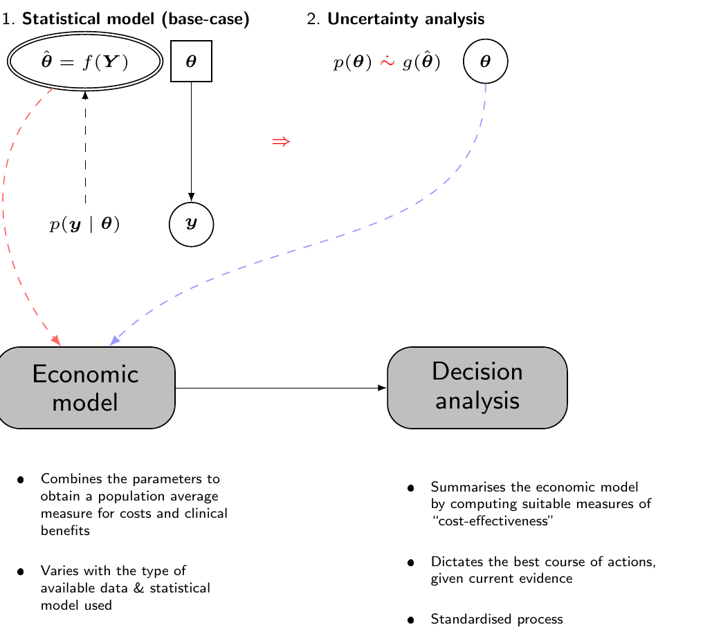
First, the statistical analysis is used to obtain an estimate for the “base-case” analysis, for instance using the point estimate described by the maximum likelihood estimator for the parameters of interest. This value is fed to the “Economic model” to obtain suitable measures of population benefit and costs, with which we can then perform the decision analysis, for instance to construct the ICER or the expected net benefit. In this case, all the expectations are computed with respect to the sampling variability associated with the observed data.
Then, separately, in order to account for the uncertainty in the parameter estimates, we use Monte Carlo or bootstrap simulations to construct a pseudo-distribution \(g(\hat{\boldsymbol{\theta}})\) – see again Figure 4.4, where we use the symbol \(\mathrel{\dot\sim}\) to indicate that the distribution \(p(\theta)\) cannot model epistemic uncertainty on the parameters, as there is no such thing for a frequentist/maximum likelihood approach. Conversely, \(g(\hat{\boldsymbol{\theta}})\) is a function of the data and the only variability is generated by the sampling process, in line with the frequentist/maximum likelihood philosophy (see also Baio, 2025 for more details on the distinction between Bayesian and non-Bayesian inference).
To give an example, a parameter \(\theta\) may indicate a proportion and we may consider \(g(\hat\theta) =\text{Beta}(a,b)\) to first map the range of values supported by the 95% confidence interval around the point estimate \(\hat\theta\) (a process similar to the one described in Example 1.4, in Section 1.2.4 and then in Section 1.2.6) and then to forward-sample a large number of possible values, to capture the underlying uncertainty in the parameter estimates. These simulated values are passed onto the Economic model and the analysis is repeated all the way to the Decision analysis, in order to construct a pseudo-distribution of the entire decision-making.
We can think of this process using a tabular format, as shown in Table 4.1. Here, we report in each row the simulations from the posterior distribution: we assume that the model is characterised by \(Q\) parameters \(\theta_1,\ldots,\theta_Q\) – some models will only have a relatively limited number of parameters, but more complex ones (e.g. in network meta-analysis, see Chapter 7) may include a very large number.
| Parameter simulations | Expected utility | ||||||
|---|---|---|---|---|---|---|---|
| Sims | \(\theta_1\) | \(\theta_2\) | \(\ldots\) | \(\theta_Q\) | \(\text{NB}_1(\boldsymbol{\theta})\) | \(\text{NB}_2(\boldsymbol{\theta})\) | \(\text{IB}(\boldsymbol{\theta})\) |
| 1 | 0.58 | 0.38 | \(\ldots\) | 0.42 | 77480 | 67795 | -9685 |
| 2 | 0.51 | 0.02 | \(\ldots\) | 0.08 | 87165 | 106535 | 19370 |
| 3 | 0.61 | 0.14 | \(\ldots\) | 0.06 | 58110 | 38740 | -19370 |
| 4 | 0.2 | 0.73 | \(\ldots\) | 0.73 | 77480 | 87165 | 9685 |
| \(\ldots\) | \(\ldots\) | \(\ldots\) | \(\ldots\) | \(\ldots\) | \(\ldots\) | \(\ldots\) | \(\ldots\) |
| 1000 | 0.03 | 0.2 | \(\ldots\) | 0.56 | 48425 | 87165 | 38740 |
| Average: | \(\mathcal{NB}_1\!=\,\)72365.35 | \(\mathcal{NB}_2\!=\,\)77403.49 | \(\text{EIB}\!=\,\)5038.14 | ||||
If we treat each row separately and pretend that the simulated values for the parameters are the “true” ones, then we can compute the “known-distribution” expected utilities \[ \text{NB}_t(\boldsymbol{\theta}) = \text{E}\left[nb_t \mid \boldsymbol{\theta} \right] \] and, assuming \(T=2\), the “known-distribution” incremental benefit \[ \text{IB}(\boldsymbol{\theta}) = \text{NB}_2(\boldsymbol{\theta}) - \text{NB}_1(\boldsymbol{\theta}). \] With these, we can check which intervention is associated with the highest value.
For instance, in simulation 1 in Table 4.1, the status quo \(t=1\) is associated with a known-distribution expected utility \(\text{NB}_1(\boldsymbol{\theta})=77480\). In this case, this is larger than the resulting value for \(t=2\), \(\text{NB}_2(\boldsymbol{\theta})=67795\). Consequently, if we were able to resolve the uncertainty in the parameter to the values simulated at this iteration, we would select \(t=1\) as the most cost-effective treatment (for this reason, the value for \(\text{NB}_1(\boldsymbol{\theta})\) is typeset in italics, in the first row of Table 4.1).
In other words, if the future turned out to be as characterised by the parameters profile in iteration 1, then \(t=1\) would be the most cost-effective intervention – this is also consistent with the fact that, in the first row of Table 4.1, the incremental benefit \(\text{IB}(\boldsymbol{\theta})<0\), indicating that \(t=2\) would produce a lower expected utility.
Of course, this is only one simulations and in order to characterise fully the underlying parametric uncertainty, we need to consider the whole lot – say 1000 simulations as in Table 4.1, effectively deriving a full distribution of decisions.
We can summarise the process overall (i.e. given current evidence and assumptions) by taking the averages over the distribution of \(\boldsymbol{\theta}\) for the two known-distribution expected utilities \[ \mathcal{NB}_t = \text{E}\left[\text{NB}_t(\boldsymbol{\theta})\right], \] and selecting as optimal the intervention associated with the highest value \[ \mathcal{NB}^*=\max_t\mathcal{NB}_t, \tag{4.5}\] or, in the case of \(T=2\), equivalently by computing \[ \text{EIB}= \text{E}\left[\text{IB}(\boldsymbol{\theta})\right] \] and comparing it with 0.
In the case of Table 4.1, \(\mathcal{NB}_1=72365.35 < \mathcal{NB}_2=77403.49\) and thus it would \(t=2\) to in fact represent the most cost-effective alternative, overall – this is why the value for \(\mathcal{NB}_2\) is typeset in bold and, for the same reason, why \(\text{EIB}>0\), in Table 4.1.
Note 4.3: Tell me you’re a Bayesian without telling me you’re a Bayesian…
The uncertainty analysis described above sounds suspiciously similar to a full Bayesian approach, in which we formally express uncertainty in the model parameters using a probability distribution. Technically speaking, the two are quite not the same – in the standard, frequentist approach to cost-effectiveness analysis, there is no such thing as a full joint distribution for the model parameters. The Monte Carlo psuedo-distribution is used to try and account for the fact that the evidence base is naturally not definitive and this will have an impact on the confidence with which we can make a decision.
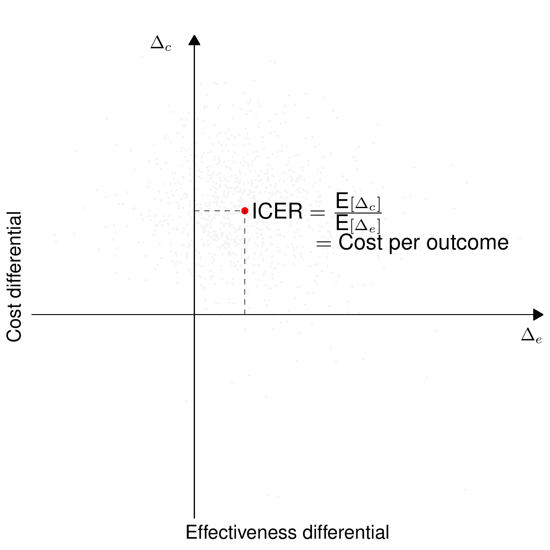

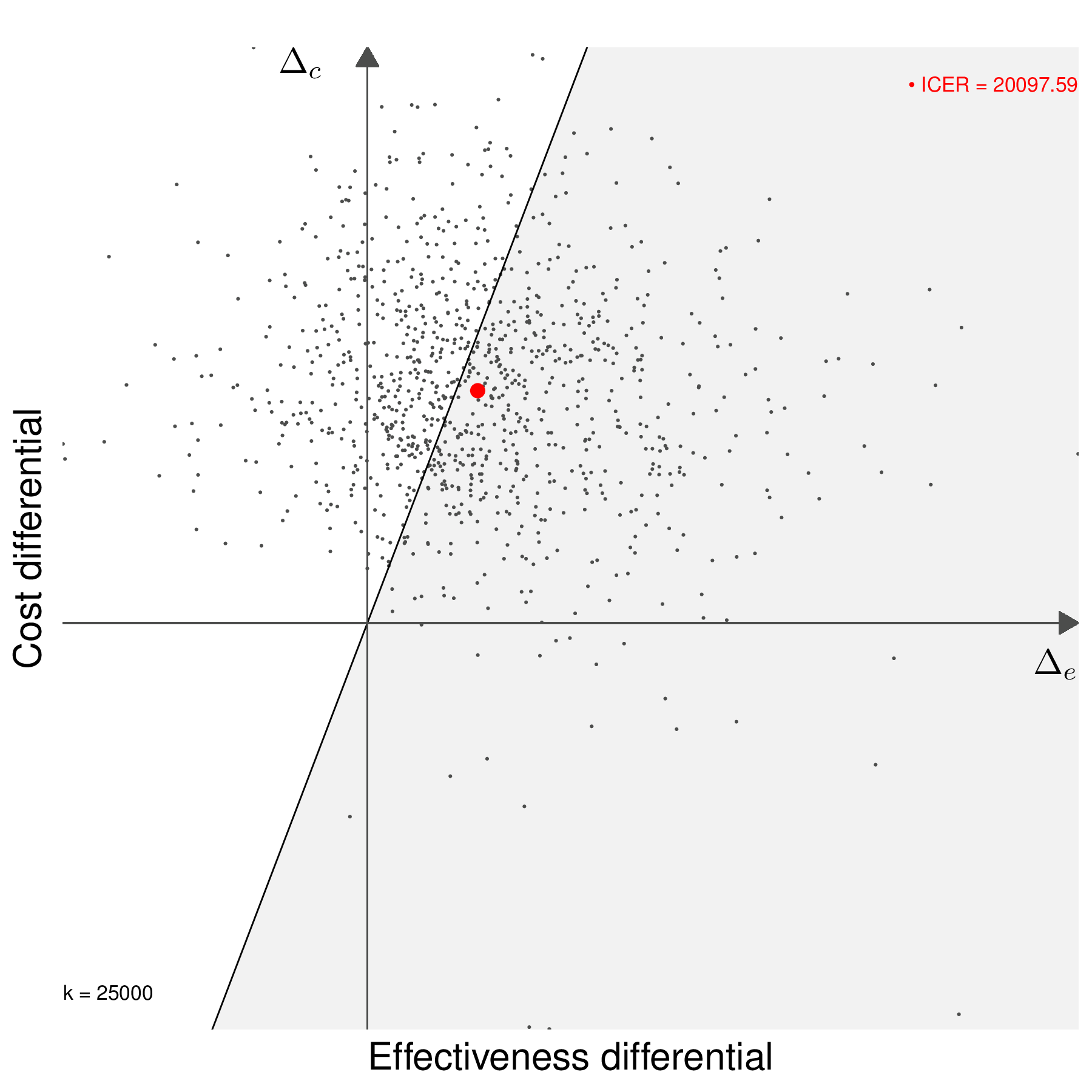
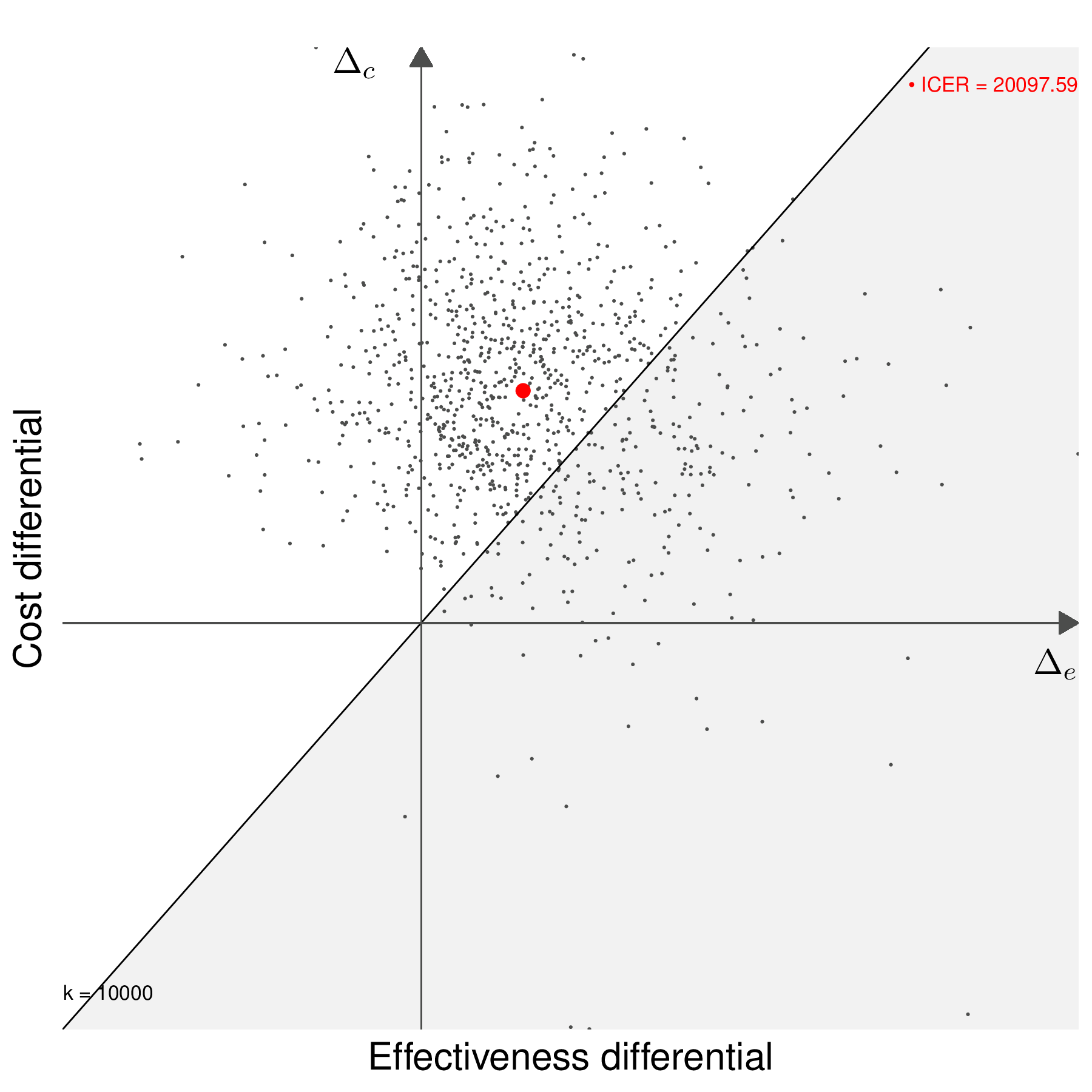
Another way of describing the full process of economic evaluation and uncertainty analysis is graphically using the cost-effectiveness plane (previously introduced in Figure 4.3), as shown in Figure 4.5.
Figure 4.5 (a) shows the ICER (the dot, obtained in correspondence of the averages for \(\Delta_e\) and \(\Delta_c\)). In line with the discussion above, the new intervention dominates the status quo in the south-eastern quadrant and is dominated in the north-western quadrant of the cost-effectiveness plane. In the south-western and the north-eastern quadrant, the decision based purely on the ICER is not immediate.
Figure 4.5 (b) shows the full economic evaluation obtained by “exploding” the point estimate (the ICER) through the pseudo-distribution of the model parameters. This describes the uncertainty associated with the base-case decision.
Figures 4.5 (c) and 4.5 (d) show the decision-making process based on including a willingness to pay threshold, \(k\). The two graph also show the “sustainability area” (Baio, 2012), i.e. the part of the cost-effectiveness plane which lies below the line \(\Delta_c = k\Delta_e\). In Figure 4.5 (c), the ICER lies in the grey area (in this case for a value of \(k=25\,000\) monetary units), where \(t=2\) is an acceptable choice because the additional benefit is achieved at a smaller unit cost than the selected value of \(k\) (or, in other words, \(\text{ICER}< k\)). Conversely, if a different willingness-to-pay threshold had been selected, e.g. \(k=10\,000\) monetary units, as in Figure 4.5 (d), then \(t=2\) would be unacceptable. Similar considerations would apply if the ICER was in the south-western quadrant of the cost-effectiveness plane inside or outside the sustainability area.
Generally speaking, the proportion of points in the sustainability area gives an indicative measure of the uncertainty underlying the decision-making process – the more “possible futures” end up in the sustainability area, the more confident we can be about the decision made under current evidence (e.g. as described by the ICER).
4.3.2 Bayesian approach to cost-effectiveness analysis
In many ways, the process of uncertainty analysis is much more natural from a Bayesian perspective, in which everything happens “in one go”, as shown in Figure 4.6: the prior and the sampling distribution are combined and, once the posterior distribution \(p(\boldsymbol{\theta}\mid \boldsymbol{y})\) is obtained, then we can use for example MCMC simulations to characterise its uncertainty and feed each simulation directly to the “Economic model” and then the “Decision analysis” block, effectively creating a full distribution of decision-making processes as the basic model output. In other words, Figure 4.5 (b) is the direct result of the Bayesian decision-making process – the order is somehow “flipped around” in comparison to the frequentist counterpart.
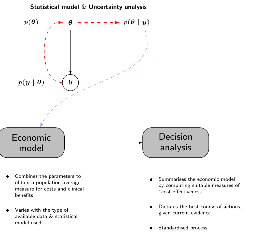
The only difference with a “normal” Bayesian analysis, where the estimates for the quantities of interest are obtained by marginalising out all the sources of uncertainty (sampling variability and epistemic uncertainty), is that in the process of PSA we want to examine the impact of the parameter uncertainty on the decision-making.
In order to do so, we effectively consider the induced full distribution of decisions to quantify how much the uncertainty in the model parameters affect the final cost-effectiveness assessment, though the conditional quantities \(\text{NB}_t(\boldsymbol{\theta})\) and \(\text{IB}(\boldsymbol{\theta})\). The tabular description of the process shown in Table 4.1 remains the same – but in a Bayesian context, the simulations for the \(Q\) model parameters come directly from the joint posterior distribution \(p(\boldsymbol{\theta}\mid\boldsymbol{y})\) and, more importantly, they are the core output of the statistical analysis.
The best decision based on current evidence is obtained by averaging out all the uncertainty (e.g. by considering \(\mathcal{NB}_t=\text{E}\left[\text{NB}_t(\boldsymbol{\theta})\right]\)), but we can also assess how much uncertainty there is around that overall best decision, in terms of the posterior distribution of the model parameters. This quantifies the impact of parameter uncertainty on the decision-making process.
NoteIt’s good to be Bayesian (in HTA)
The Bayesian and frequentist approaches may look very similar at face value, in this context – but there are fundamental differences.
Firstly, while it is in principle possible to construct a multivariate version of the Monte Carlo psuedo-distribution \(g(\hat{\boldsymbol{\theta}})\) from which to simulate values for the PSA, this process would involve increasing complexity and, in practice, most often the simulations are drawn independently for the \(Q\) model parameters. Conversely, the Bayesian analysis returns as the primary outcome a full joint posterior distribution for all the model parameters. For simplicity, we may assume prior independence among some of the \(Q\) parameters, but, by effect of the observed data, the posterior will capture any correlation present among the parameter.
Related to the first point, in models characterised by a very simple structure, running a MCMC analysis may increase the computational cost by a large factor, at least relatively speaking (we return to this point, for instance, in Note 8.4 in Section 8.3.4). However, when the model becomes more and more complex and we start adding relevant structure (including composite sources of evidence, as we show in Chapter 6 and Chapter 7), building a frequentist version also involves notable computation, e.g. to maximise a highly dimensional likelihood function. In that case, the MCMC process is likely to become a more cost-effective tool, also in terms of running time and certainly in allowing more flexibility in the modelling framework.
From a philosophical point of view, a Bayesian approach seems to apply naturally to the problem of decision-making: the evidence upon which we must base our decision is naturally subject to uncertainty (that is the very reason why we consider PSA) and if we are willing to model this (very possibly epistemic) source of uncertainty using a probability distribution, then we are able to formally propagate this across all the decision-making process – this is effectively what we want from PSA!
4.3.3 Summarising uncertainty analysis
Very often, uncertainty analysis is summarised using the concept of Cost-Effectiveness Acceptability Curve (CEAC, Van Hout et al., 1994). This is computed as \[ \text{CEAC}= \Pr(\text{IB}(\boldsymbol{\theta}) > 0) \] – technically, from a Bayesian point of view, this is a posterior probability given the observed data and thus, perhaps, a more formal notation would be \(\Pr(\text{IB}(\boldsymbol{\theta}) >0 \mid \boldsymbol{y})\). The value of the \(\text{CEAC}\) depends specifically on the willingness-to-pay parameter, \(k\); basically, for each choice of \(k\) in a usually discrete grid of values, e.g. \(k=(0,100,200,300,\ldots,10000)\), we can compute the proportion of PSA simulations that fall in the sustainability area – see Figures 4.5 (c) and 4.5 (d).
Figure 4.7 shows the CEAC computed for the example shown schematically in Table 4.1. Here, we consider a grid of \(k\) values from 0 to 50 000 monetary units, with increments of 100. For each of these values, we plot the resulting proportion of PSA simulations for which \(\text{IB}(\boldsymbol{\theta})>0\) – these computations happen automatically when using the R package BCEA (Baio et al., 2025). We present more details throughout the next chapters and specifically in Example 5.6.
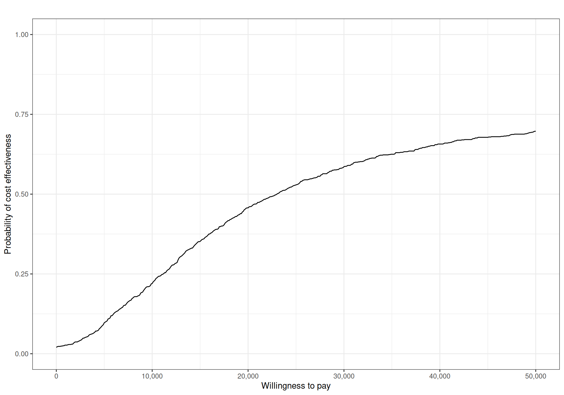
Generally speaking, for a given willingness-to-pay threshold, we would like the CEAC to have “large enough” values, to indicate that decision uncertainty is negligible – typical thresholds are often somewhat artificially put at around 80%. In addition, in general, the CEAC alone cannot be used to determine the optimal intervention, for a given value of the willingness-to-pay: by definition, the CEAC only quantifies the probability that the intervention under consideration (\(t=2\), in this case) is optimal, for any particular value of \(k\) (Fenwick et al., 2001).
When the number of interventions \(T>2\), we can still process each pairwise comparison, e.g. set \(t=1,2,3\) as the comparators and \(t=4\) as the main intervention, for which we want to assess the cost-effectiveness and then produce \((T-1)\) CEACs, describing the probability that \(t=4\) is the most-cost-effective intervention against either of the other options.
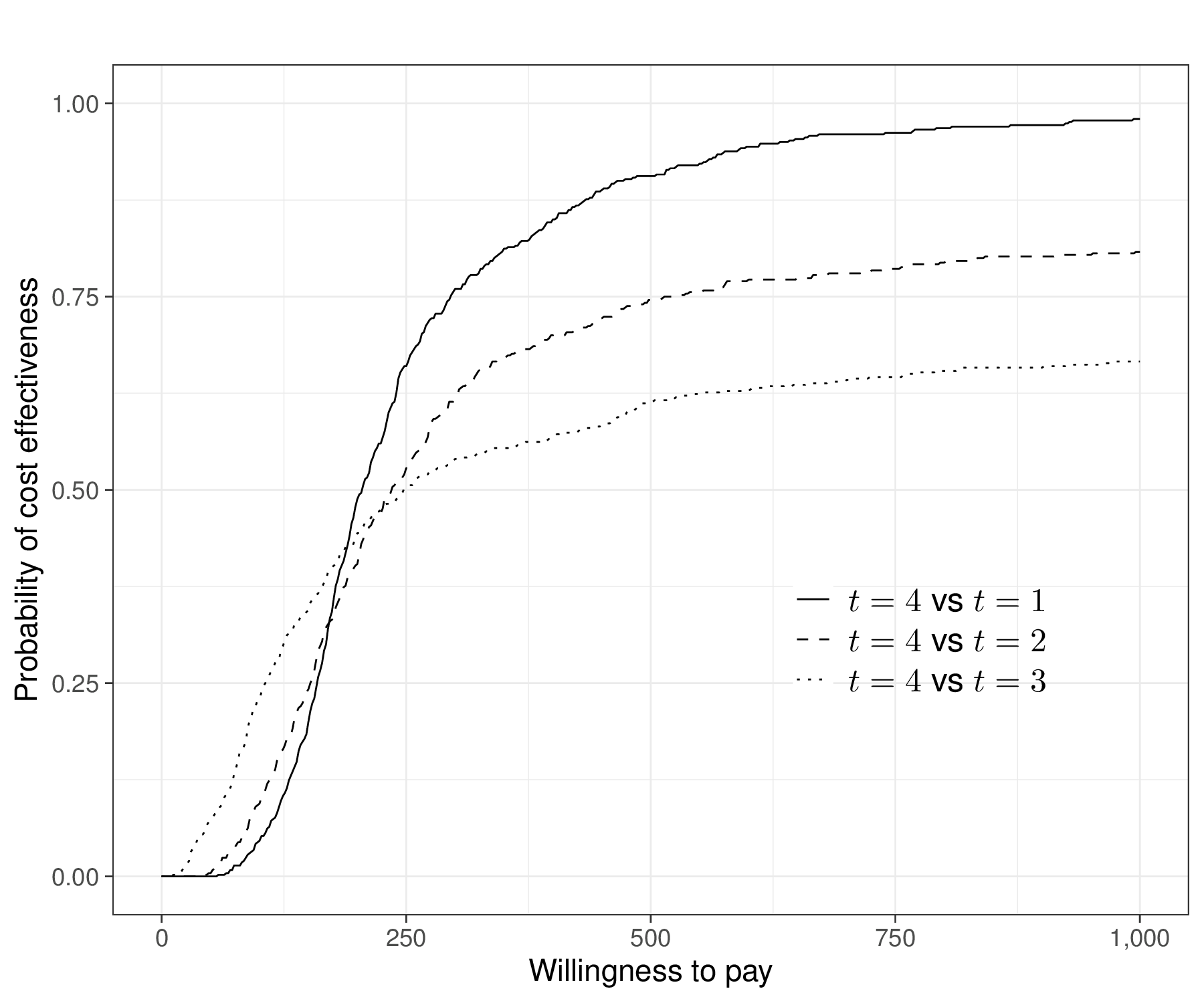
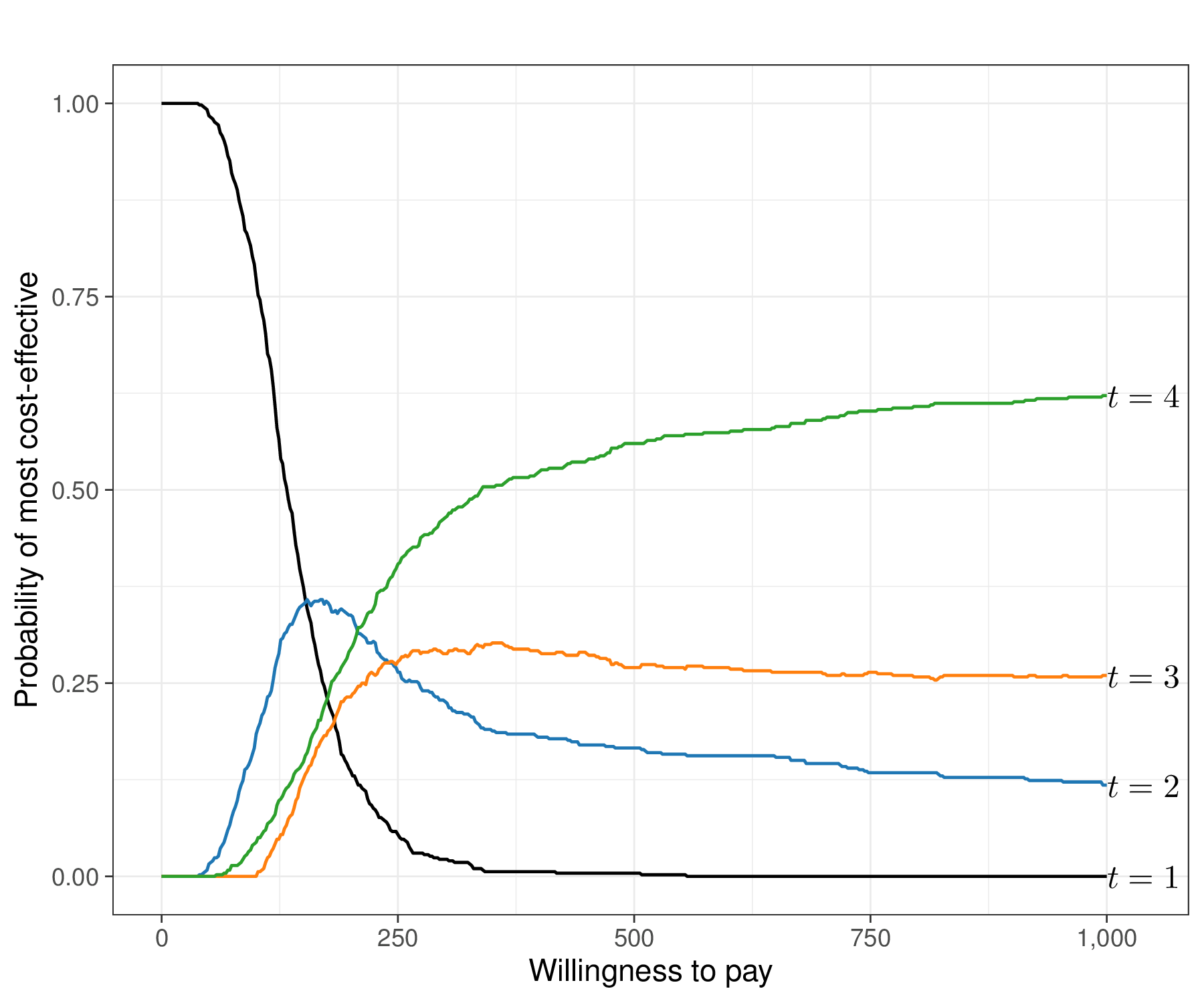
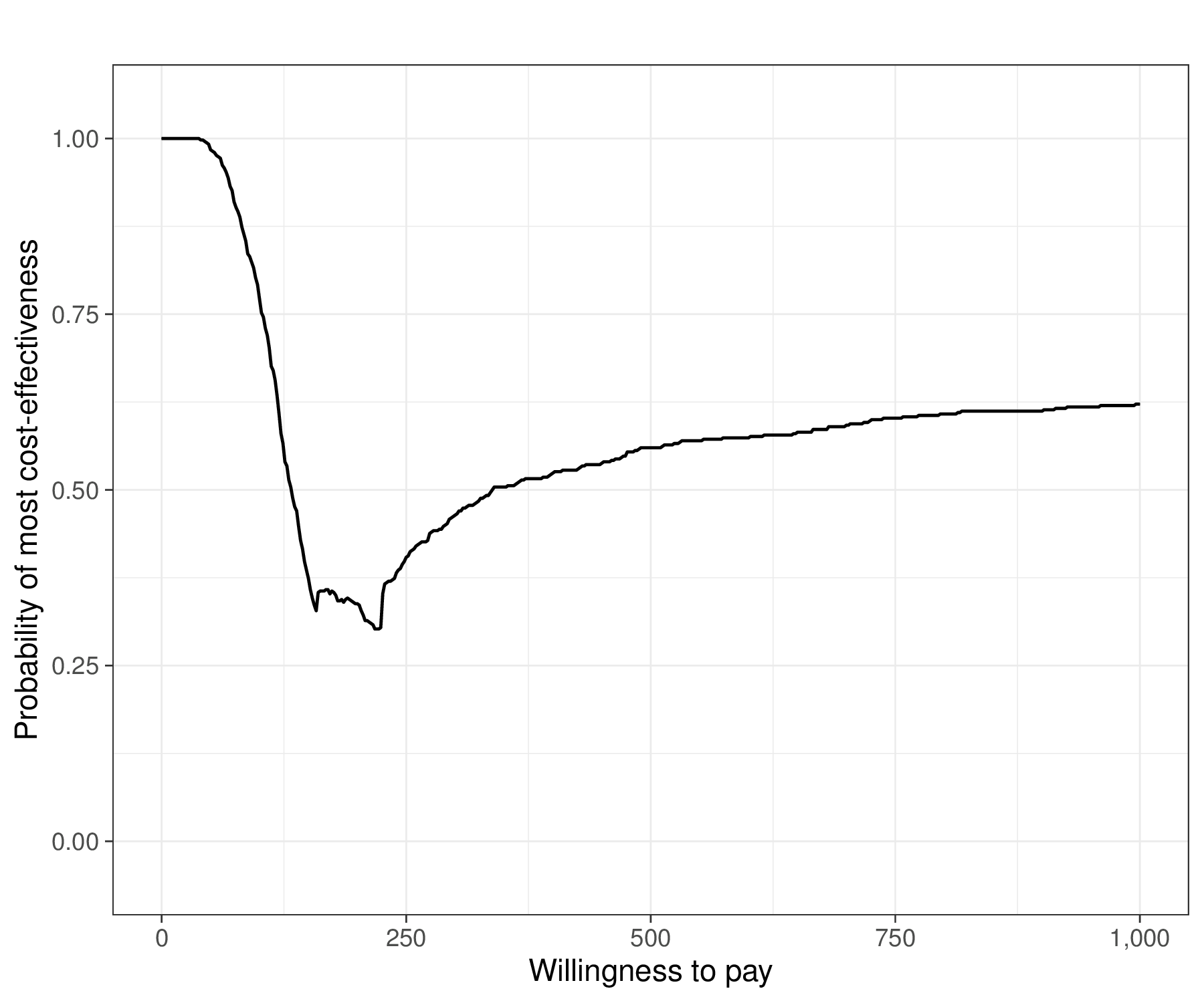
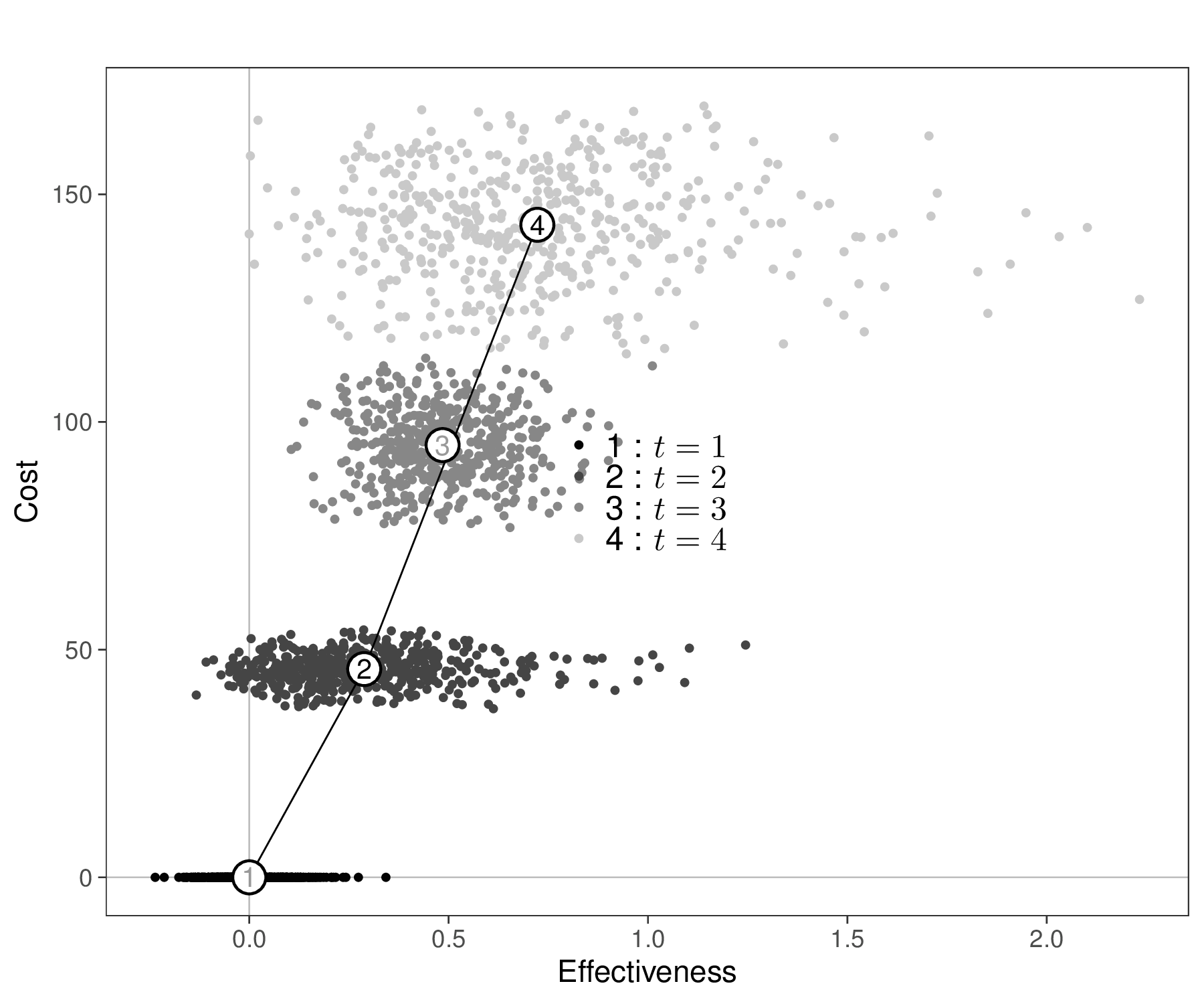
Figure 4.8 (a) shows this graph over a grid of values for \(k\) in \([0;1000]\). As is possible to see, in this case, for all pairwise comparisons, the CEAC is increasing and, by the end of the range in the \(x\)–axis, it exceeds 0.5 against all the alternative intervention, in fact reaching larger values (close to 0.8 for the comparison against \(t=2\) and close to 1 for the comparison against \(t=1\)).
In addition, we may also want to assess the overall performance of the alternatives. Figure 4.8 (b) shows the absolute probability that each of the \(T=4\) interventions is the one associated with the highest net benefit, for each value of \(k\) in the grid \([0;1000]\) – these probabilities are computed as the proportion of PSA simulations in which \(t=\arg\max_t \mathcal{NB}_t\).
In this case, the probability that \(t=1\) is optimal is very large for very small values of \(k\), only to tail off very rapidly towards 0. \(t=4\) becomes the intervention associated with the highest chance of being the most cost-effective at around 200 monetary units along the \(x\)–axis, but there is a short interval in which \(t=2\) is the optimal intervention.
We can consolidate these findings into the Cost-Effectiveness Acceptability Frontier (CEAF, Fenwick et al., 2001). This is shown in Figure 4.8 (c) and Baio et al. (2025) detail how to obtain the resulting graphical output using the R package BCEA. The CEAF is computed for each given value of the threshold \(k\) as the probability of cost-effectiveness for the optimal intervention (i.e. the one associated with the highest expected utility, in correspondence of that value of \(k\)). This analysis reveals “switch points” where the best strategy changes. In this case the piecewise curve shown in Figure 4.8 (c) is the combination of the three parts in which \(t=1\), then \(t=2\) and then \(t=4\) are the optimal interventions.
Figure 4.8 (d) shows also the Cost-Effectiveness Efficiency Frontier (CEEF, Fenwick et al., 2001). This is a graphical representation that illustrates the most efficient interventions in terms of cost versus health outcomes (benefits). More specifically, it shows the trade-off between cost and effectiveness for various health technologies or interventions.
In the graph, each intervention is plotted as a point based on its average cost and health outcome – in Figure 4.8 (d), these are the numbered circles and we also display the underlying uncertainty around this average estimate in terms of the PSA simulations. In this case, we scale the axes so that \(t=1\) sits in the point \((0,0)\), by using the option start.from.origins=TRUE in the BCEA function ceef.plot().
The efficiency frontier is formed by connecting the points of interventions that provide the best possible trade-off between cost and effectiveness. Interventions on the frontier are considered efficient because no other intervention offers greater effectiveness for the same or lower cost. In contrast, interventions below the efficiency frontier are generally less cost-effective; they require more resources for less health benefit. The slope of the line connecting different points on the efficiency frontier is equivalent to the ICER.
For example, in Figure 4.8 (d) interventions \(t=1\), \(t=2\) and \(t=4\) are directly connected by the frontier. This is consistent with the analysis of Figures 4.8 (b) and 4.8 (c), in which we have identified them as the optimal intervention for different choices of \(k\). Conversely, \(t=3\) is just inside the frontier, i.e. it does not lie on the segment connecting \(t=2\) and \(t=4\): it sits slightly to its left, to indicate that there is no value of \(k\) in correspondence of which \(t=3\) is the most cost-effective intervention.
Note 4.4: Limitations of the CEACs
A major limitation of CEACs is that they do not account for the actual consequences of the underlying decision uncertainty. For example, consider the following, admittedly rather silly example:
- Intervention \(t=2\) is deemed to be more cost-effective than a comparator \(t=1\), given current evidence and \(\text{CEAC}=\Pr(t=2 \text{ is cost-effective}\mid\text{current data})=0.51\). In this case, the uncertainty in the model inputs generates substantial uncertainty in the decision. However, imagine that, if we “get it wrong” and in fact given more evidence we would be able to determine that \(t=1\) is more cost-effective, we would need to bear: a) an increase in population average costs of 3 monetary units; and b) a decrease in population average effectiveness of 0.000001 benefits.
- Intervention \(t=2\) is again deemed to be more cost-effective than a comparator \(t=1\), given current evidence, this time with \(\text{CEAC}=\Pr(t=2 \text{ is cost-effective} \mid \text{current data})=0.999\). However, in this case, if we get it wrong and more information would tell us that the opposite is true, we would face consequences of a) an increase in population average costs of 100 million monetary units; and b) a decrease in population average effectiveness of 100 million benefits.
In case 1., although the uncertainty is substantial, there really is no point in agonising over it and perhaps delaying making a decision until more evidence becomes available, because the pay-offs are effectively negligible. In case 2., conversely, although the uncertainty is minimal, the consequences in the rare event where we make the wrong decision are dire and therefore we may want to consider postponing a firm commitment to the new intervention, until we can remove, or at least reduce the possibility of making it. We return to these considerations in Chapter 12, in which we discuss the analysis of the value of information.
4.3.4 Structural uncertainty
All the discussion above has been based on the premise that the main sources of variation in the decision-making process are given by the sampling distribution that characterises the observed data and the uncertainty associated with the model parameters (with the caveats of Note 4.3 above, in terms of the frequentist approach). In other words, as mentioned throughout the chapter, the decision is made given current evidence and the model assumptions.
However, there is often a strong sense that in fact we cannot be entirely confident in the “structural assumptions” underpinning our model. Critical examples include the assessment of how the down-stream decision-making process would change if we used a given sampling distribution instead of a potential alternative one (see specifically the analyses in Chapter 5 and the discussion in Chapter 8), or whether we should used “fixed” or “random” effects, to build up a Network Meta-Analysis (see Sections 6 and 7).
One obvious solution is to run different version of the overall model and then perform some sort of “scenario sensitivity analysis” by reporting the results of the decision analysis for each different modelling choice. This may be a reasonable idea, but it has the considerable downside that each scenario is considered separately and we still need to find a way to rank them, possibly in terms of how well the underlying modelling assumption align with the observed data – we return to this point in Sections 5.3 and 6.2.6.
Baio (2012, sec. 3.6) presents a possible framework for structural uncertainty based on a form of model averaging, where separate distributional assumptions are tested and then the various models are combined in a sort of weighted average, where the weights are proportional to measures of model fit. This type of analysis can be implemented for the health economic evaluation using the BCEA function struc.psa() – see also Baio et al. (2025, sec. 4.4). We return to this point in Section 5.3.5, Example 5.6 and, briefly, in Note 6.4 in Example 6.6.
4.4 Conclusions
This chapter has described a general introduction to the statistical foundations underpinning the general problem of health technology assessment; in particular, we have discussed the fundamental nature as a decision problem, as well as the importance of the assessment of the impact of uncertainty in the model inputs onto the final decision-making process.
This is closely related to the Bayesian framework of the problem, in which this uncertainty is handled naturally as a prima-facie feature of the modelling structure. We have also shown the general measures of analysis, which will be used in the rest of the book to quantify the “value for money” associated with various interventions.
In the next chapter, we begin the exploration of the most important modelling framework for HTA, starting from the case of individual-level data, typically relevant for economic evaluation alongside clinical trials.
On occasions when he wants to be particularly annoying (even more than usual), the author would argue that the naming is to some extent a “historical accident” – health economics has been invented by economists and certainly is grounded in economic theory. But by necessity this process does involve many other key components (among which, arguably, Statistics is a cornerstone).↩︎