‘Seriously George: worse than Clegg?’
Nothing much on the telly tonight, so I’m catching up with the blog… The Guardian has published this update on net approval ratings for some top politicians in the UK. These are computed as the difference between the proportion of people approving of a certain politician and those not approving of them.
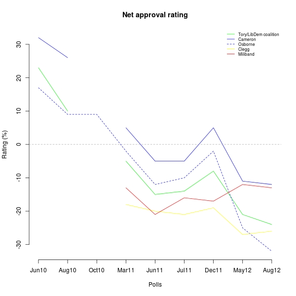
I took the original data and made this simple plot of the ratings against the last few polls, running from when the new government was voted in (June 2010) to a couple of days ago.

As is evident, in the last two polls (ie after revealing the new budget last March), the chancellor George Osborne is plummeting down in the ratings and is now even below the deputy Prime Minister Nick Clegg. [To put this in perspective if you’re reading and are not familiar with the UK political scene: earlier this month, I was out having drinks with a few friends, one of whom happens to live in Putney in the same street as Clegg. He told us that one time a few months ago he could not get home because the narrow street was all blocked by protesters demonstrating against him.]
Until December 2011, it seems as though the coalition ratings (in green, as is the combination of blue/Tory and yellow/LibDems) were basically following Cameron’s (the blue solid line) and Osborne’s (the blue dashed line, slightly above his leader), with Clegg mainly responsible for “bringing the average down” (though the coalition rating is technically not a simple average).
But since the budget, it is mostly Osborne who has driven the downwards trend of the coalition. If the polls are anything to go about, Cameron has also suffered but, unfortunately, dare I say (I’m not a great fun, to put it ridiculously mildly) is now sort of stable. Clegg is may be even, very marginally, benefitting from this. Even more interestingly, the British public seem to like no-one at the moment. But I guess this is kind of typical in political science, in between elections?