| 73.134 | 54.311 | 82.485 | 68.569 | 47.659 |
| 75.259 | 82.401 | 52.116 | 61.638 | 31.907 |
| 69.135 | 56.550 | 66.988 | 85.416 | 69.868 |
| 42.871 | 93.900 | 39.348 | 54.570 | 49.476 |
| 67.182 | 77.861 | 20.851 | 72.541 | 92.979 |
1 Basic concepts
Broadly speaking, the objective of statistical analysis is to produce “some summary” of the available data.
Sometimes, it is (at least theoretically) possible to deal with an entire population of observable quantities. We often refer to these quantities as variables that may take any one of a specified set of values, for a given individual. Examples are age (of persons), income (of households), socio-economic class (of workers). Data are the set of values of one or more variables recorded on one or more individuals or items.
An example of the theoretical construct underpinning the concept of population is represented by a census. In such cases, every single unit that is present in the population (and is thus of interest to the research question) is actually measured. We can use these measurements to summarise the information provided by the data using what are often called descriptive statistics. Notice that, particularly in this idealised case where we have observed everyone in the population, it is important to be able to fully characterise the underlying measurements with easily-interpretable quantities (as opposed to looking at each single measurement).
In addition, as mentioned above, the idea of a “population” is often elusive: in the case of the census, everybody living in a given country is supposed to fill in the questionnaire and thus provide extensive information about themselves. So, surely we collect information about the whole population. Or do we?… The problem is that populations are intrinsically dynamic — people die and new babies are born. Similarly, people get married or divorced (thus changing their marital status).
Consequently, the very concept of “population” and the idea that we may be able to fully observe everything is pretty much wishful thinking. Moreover, even if we could think of an entire observed population, it may still be impossible to obtain data on each and every individual/unit. There are several reasons for this:
- Economic reasons: to measure as many units as there are in the population may cost too much money, thus limiting the usefulness of the information collected;
- Accuracy reasons: it may be better to measure very precisely a limited number of units, than just investing the same amount of resources to collect less precise information on a larger number of individuals;
- Physical reasons: sometimes, the very act of measurement destroys the unit. For example, consider the case in which you want to know the life-time of a population of 100 bulbs. You may light all of them and measure how long it takes before they all burn. And you would have very precise information about this quantity. But at the end of the process, you would not have any bulb left to use…
For these reasons, invariably we rely on information obtained from a sample of units, drawn from the population of interest, for which a measurement is indeed available. We can use these units to make inference about the (theoretical) underlying population.
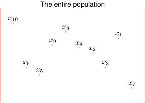
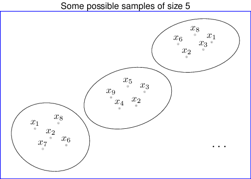
Figure 1.1 shows a schematic representation of the process moving from a theoretical population (made by \(N=10\) units) to some potential samples of size \(n=5\). Typically, we indicate the population parameters (e.g., the “true” mean and standard deviation, that we could compute if we could access the whole population — more on the definition of these quantities later in this chapter) using Greek letters, e.g., \(\mu\) or \(\sigma\). Ideally, we would like to learn about these quantities — but as mentioned above, we really cannot observe the whole population (which, again, might not even exist as such!). Thus, we rely on the sample statistics, which we indicate using Roman letters, e.g., \(\bar{x}\) for the sample mean and \(s_x\) for the sample standard deviation (see Section 1.5 for more details on the definition, meaning and use of these quantities).
Example 1.1 (Many samples?) Consider the following idealised situation. You are some kind of God and know all there is to know about a specific population of individuals. You are also a very lucky God, because this population of interest is relatively small and only formed by \(N=25\) units. The “true” data showing the weight (in Kg) for each individual are presented in Table 1.1, which we indicate as \(y_i\).
Some basic properties of the whole population are the following:
- Total size: \(N=25\);
- Mean weight: \[\mu= \sum_{i=1}^N \frac{y_i}{N} =63.561.\] This is a measure of “central tendency” (more on this later, in Section 1.5);
- Standard deviation: \[\sigma = \sqrt{\sum_{i=1}^N\frac{(y_i-\mu)^2}{N}}= 18.544.\] This is a measure of variation around the mean (more on this later, in Section 1.5).
For some reason, you decide that you do not want to share the whole population data — but only make available a smaller sample, randomly selected from it. Of course, there are many possible ways of sampling from this population (and of course, if you had a much bigger population, there would be even more ways — again, more on this later in Chapter 2).
Say you consider three possible samples, as given by the table below. Each sample is determined by the individual Id (a number from 1 to 25) — these are associated with the whole population values in Table 1.1 reading along the rows (so that the first column indicates Ids 1,\(\ldots\),5; the second column indicates Ids 6,\(\ldots\),10; etc.).
Three possible samples from the entire population
| Selected Id | Weight |
|---|---|
| 1 | 73.134 |
| 2 | 75.259 |
| 3 | 69.135 |
| 4 | 42.871 |
| 5 | 67.182 |
| 6 | 54.311 |
| 7 | 82.401 |
| 8 | 56.550 |
| Selected Id | Weight |
|---|---|
| 13 | 66.988 |
| 14 | 39.348 |
| 15 | 20.851 |
| 16 | 68.569 |
| 17 | 61.638 |
| 18 | 85.416 |
| 19 | 54.570 |
| 20 | 72.541 |
| 21 | 47.659 |
| Selected Id | Weight |
|---|---|
| 2 | 75.259 |
| 9 | 93.900 |
| 17 | 61.638 |
| 1 | 73.134 |
| 20 | 72.541 |
| 23 | 69.868 |
| 13 | 66.988 |
If we consider the equivalent summary statistics to the whole population, we get the following results:
- Sample 1:
- Sample size \(n_1=8\);
- Sample mean \[\bar{y}_1 = \sum_{j=1}^{n_1} \frac{y_j}{n_1} = 65.105;\]
- Sample standard deviation \[s_1 = \sqrt{\sum_{j=1}^{n_1} \frac{(y_j-\bar{y}_1)^2}{(n_1-1)}} = 12.936.\] (The reason why the denominator in the sample standard deviation becomes \((n_1-1)\) will be explored in Chapter 3.
- Sample 2:
- Sample size \(n_2=9\);
- Sample mean \[\bar{y}_2 = \sum_{j=1}^{n_2} \frac{y_j}{n_2} = 57.509;\]
- Sample standard deviation \[s_2 =\sqrt{\sum_{j=1}^{n_2} \frac{(y_j-\bar{y}_2)^2}{(n_2-1)}} = 19.408.\]
- Sample 3:
- Sample size \(n_3=7\);
- Sample mean \[\bar{y}_3 = \sum_{j=1}^{n_3} \frac{y_j}{n_3} = 73.333;\]
- Sample standard deviation \[s_3 =\sqrt{\sum_{j=1}^{n_3} \frac{(y_j-\bar{y}_3)^2}{(n_3-1)}} = 10.136.\]
Which sample would you say is the “best” one?
Now: samples number 1 and 2 look a bit strange because they have selected consecutive units (1 to 8 for sample 1; and 13 to 21 for sample 2). This is not necessarily suspicious or wrong — but what if people were numbered according to the household in which they live? This would mean that, probably, consecutive Ids are more likely to indicate people living in the same household who are thus potentially more correlated (e.g., parents and children). This may reduce the representativeness of the sample with respect to the underlying population. Conversely, the third sample presents selected Ids that look more random and so, arguably, may be deemed to be more reliable. Interestingly, despite this desirable property, sample 3 is the one for which the summary statistics differ the most from the underlying population! (More on this later in Chapter 2).
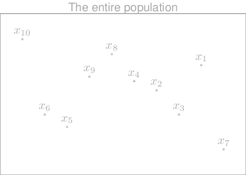
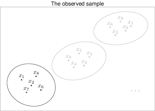
In addition, in real life (i.e. when we do Statistics), we cannot access all possible samples that could have been drawn from a given population. For example, in the trivial case above, the true population is not really accessible to us (and thus it is greyed out in Figure 1.2). We only have one such sample (and again all but the one in the left-bottom part of the right-hand side panel of Figure 1.2 are also greyed out).
Incidentally, there are in fact 252 different ways of picking at random 5 units out of the population made by 10 — but again, all but one have not been drawn. We want to use the information in the actually observed sample (e.g. the sample mean and standard deviation) to infer about the underlying population parameters. That is what Statistics is all about.
1.1 How to obtain a random sample
In general, you can think of this process as extracting numbered balls from an urn — a bit like they do when they call numbers in games such as Tombola or Bingo. If you extract the ball with number “14” on it, then you are selecting into your sample the 14-th unit from a complete list of population members.
In reality, we are likely to use a computer to simulate “pseudo-random” numbers. For example, we can use the freely available software R to sample 4 numbers from the set \((1,2,\ldots,20)\), using the following code.
# Simulate 4 numbers from the set of numbers from 1 to 20, without replacement
sample(x=1:20,size=4,replace=FALSE)
[1] 10 20 14 13The resulting values shown here can be used to in fact select the corresponding units in a list of peoples or items of interest. In this case, the option replace=FALSE instructs R to sample without replacement. This means that if a unit is selected then it is taken out from the list of units that can be selected at a later stage.
1.2 Types of data
Once we have identified a suitable procedure to sample from the underlying population, we are then confronted with the actual data to analyse. As mentioned above, data are made by variables, which may have differences in nature. The broadest categorisation in terms of types of data is probably the following.
- Qualitative (non numerical):
- Categorical: no actual measurement is made, just a qualitative judgment e.g., sex, hair colour. The observations are said to fall into categories.
- Ordinal: there is a natural ordering of the categories such as degree of severity of a disease (mild, moderate, severe), occupational group (professional, skilled manual, unskilled manual).
- Quantitative (numerical):
- Discrete: can only take one of a discrete set of values (e.g., the number of children in a family, the number of bankruptcies in a year, the number of industrial accidents in a month).
- Continuous: can in principle take any value in a continuous range, such as a person’s height or the time for some event to happen. In practice, all real observations are discrete because they are recorded with finite accuracy (e.g., time to the nearest minute, income to the nearest pound). But if they are recorded sufficiently accurately they are regarded as continuous.
1.3 Numerical data summaries
Qualitative and discrete data can be easily summarised using a frequency table.
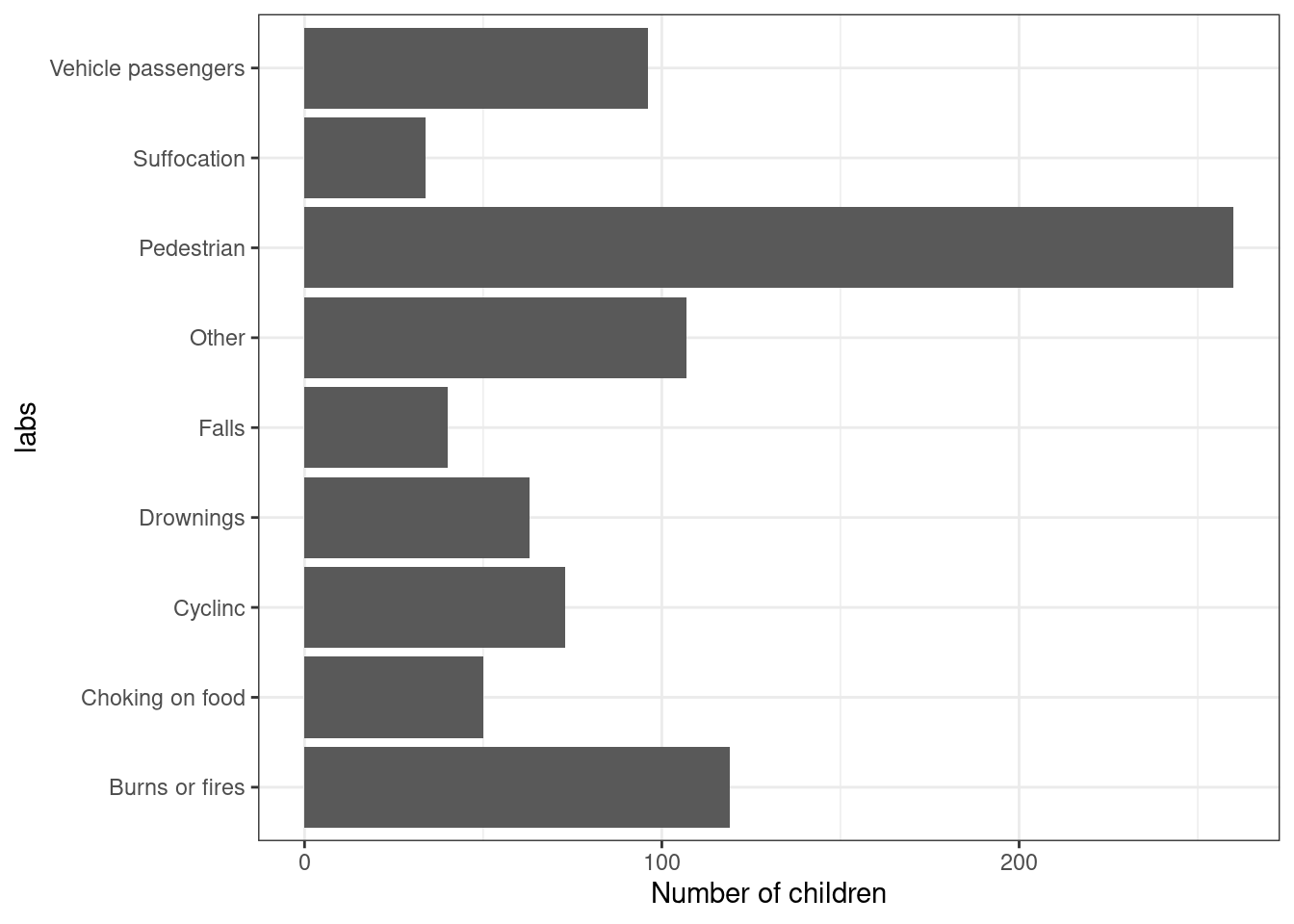
Example 1.2 (Accident data) Data are collected routinely to describe the type of accident that people have in a given time period. These are grouped according to some broad categories. The categories are the types of accident. The number of children dying from each type of accident is the frequency of that category. The relative frequency or proportion of children dying from each type of accident is the frequency divided by the total number of deaths. Multiplying the relative frequencies by 100 gives the percentages (i.e., the relative frequencies per 100 cases), as shown in Table 1.2.
In general, it is a good idea to sort out the data in terms of the frequencies, for ease of presentation.
| Number of children | Percentage | |
|---|---|---|
| Pedestrians (road; P) | 260 | 30.88 |
| Burns, fires (mainly home; B) | 119 | 14.13 |
| Vehicle occupants (road; V) | 96 | 11.40 |
| Cyclists (road; R) | 73 | 8.67 |
| Drownings (home and elsewhere; D) | 63 | 7.48 |
| Choking on food; C) | 50 | 5.94 |
| Falls (home and elsewhere; F) | 40 | 4.75 |
| Suffocation (home; S) | 34 | 4.04 |
| Other (O) | 107 | 12.71 |
When we deal with continuous data, frequency tables are not so straightforward, because the number of categories is much larger (and, theoretically, infinite).
Example 1.3 (Heights) The following data considers individual measurements of span (in inches) of 140 men.
| 68.2 | 67.0 | 73.1 | 70.3 | 70.9 | 76.3 | 65.5 | 72.4 | 65.8 | 70.7 | 65.1 | 66.5 | 67.5 | 64.4 |
| 64.8 | 72.7 | 71.9 | 73.9 | 68.3 | 66.1 | 69.9 | 68.5 | 72.5 | 67.5 | 72.1 | 71.6 | 65.6 | 65.7 |
| 64.2 | 71.6 | 73.4 | 70.8 | 71.5 | 76.0 | 68.0 | 65.1 | 70.1 | 68.4 | 71.3 | 73.9 | 70.3 | 72.4 |
| 73.9 | 72.3 | 67.6 | 70.2 | 66.6 | 75.1 | 72.2 | 65.6 | 72.2 | 67.0 | 67.1 | 70.8 | 70.7 | 68.2 |
| 69.5 | 70.0 | 73.0 | 65.0 | 70.0 | 68.2 | 69.8 | 74.8 | 73.8 | 68.3 | 65.4 | 66.5 | 67.3 | 73.2 |
| 70.8 | 71.0 | 69.9 | 75.4 | 72.2 | 68.6 | 65.5 | 68.0 | 66.3 | 67.6 | 68.0 | 69.8 | 65.8 | 68.0 |
| 68.4 | 71.0 | 71.8 | 72.3 | 67.6 | 69.4 | 73.2 | 70.3 | 70.3 | 63.9 | 70.3 | 73.9 | 66.0 | 68.4 |
| 72.7 | 67.4 | 64.3 | 71.1 | 71.2 | 69.1 | 64.7 | 73.2 | 74.0 | 66.5 | 66.7 | 66.7 | 72.2 | 61.5 |
| 72.6 | 68.3 | 71.5 | 65.5 | 70.5 | 70.7 | 67.5 | 74.2 | 69.4 | 67.1 | 70.8 | 67.8 | 70.8 | 66.9 |
| 67.5 | 66.8 | 70.4 | 70.6 | 66.5 | 70.5 | 68.2 | 74.7 | 69.7 | 66.9 | 74.0 | 67.9 | 72.1 | 61.3 |
One way of getting round the large number of different values in the dataset is perhaps to consider grouped frequency tables, such as the that in Table 1.4. This can be obtained using the following process.
- Calculate the range of the data i.e., the largest value minus the smallest value.
- Divide the range up into groups. Aim at having between 5 and 15 groups.
- Calculate the frequency of each group.
| Frequency | Relative frequency | |
|---|---|---|
| 61-62.4 | 2 | 0.014 |
| 62.4-63.9 | 1 | 0.007 |
| 63.9-65.4 | 9 | 0.064 |
| 65.4-66.9 | 21 | 0.150 |
| 66.9-68.4 | 29 | 0.207 |
| 68.4-69.9 | 11 | 0.079 |
| 69.9-71.4 | 27 | 0.193 |
| 71.4-72.9 | 20 | 0.143 |
| 72.9-74.4 | 14 | 0.100 |
| 74.4-75.9 | 4 | 0.029 |
| 75.9-77.4 | 2 | 0.014 |
The resulting table is certainly more informative than the fill list of the original values. But we are losing information by grouping the data — for instance, we only know that 5 individuals are in the range 61-62.4. However, we have lost track of the actual value for the span measurements of these 5 individuals.
1.4 Graphical summaries of data
Often, it is preferable to summarise data using pictorial representations. Different types of data are best displayed using different graphs. For example, when considering qualitative data, a good choice is given by a barplot. Using software such as R a barplot can be easily obtained using the command barplot(...) where ... is the name of the object containing the frequencies we want to depict (the barplot can be customised to produce nicer graphs than the default version — but that is for another day…).
This type of display also works for discrete data, when we can essentially plot the frequency (either absolute or relative) for each of the possible discrete values.
When we deal with continuous data, it is basically impossible to draw barplots, because it is extremely unlikely (more on this later, in Chapter 2) that two distinct observations are measured to be the extact continuous value. In this case, we can use a histogram. This is a graph of the information in a grouped frequency table. For each group, a rectangle is drawn with base equal to the group width and area proportional to the frequency for that group. In R can be obtained by the command hist(...) — note that, in general you can use the command help(...) where ... is the name of a R function (e.g., hist) to visualise extensive help on the function inputs and outputs.
Figure 1.4 shows two different histograms for the height data: the one on the left panel shows the absolute frequencies, while the right panels shows the relative frequencies.
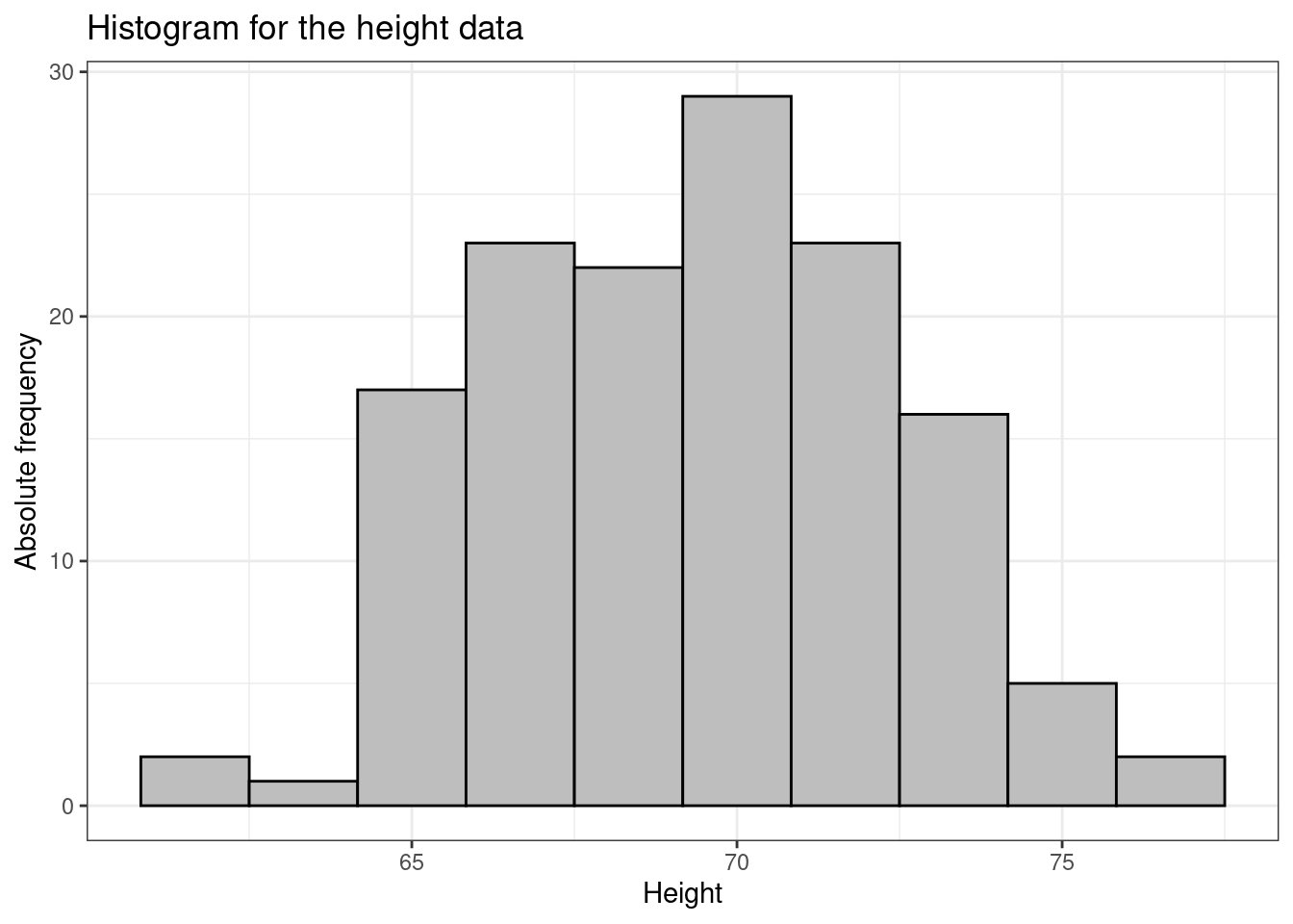
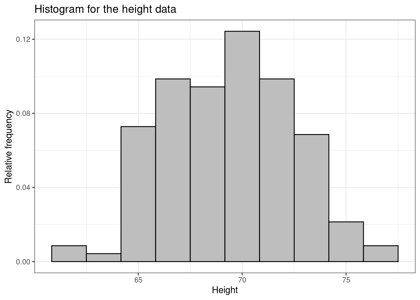
Notice that bar are drawn in correspondence with grouped values of heights. In fact, by default, R splits the range of data in intervals. Usually the groups are of equal width, as in the above example, and the height of the rectangle is then also proportional to the frequency. It is common for the vertical axis to be called “frequency” in this situation, which really means “frequency per group width” (sometimes also called “frequency density”).
We could of course modify this and present different depictions of the data according to different groupings along the \(x-\)axis. For instance, we could produce a histogram showing the frequency per 1.4 inches, as depicted in Figure 1.5.

1.5 Summary statistics
In addition to graphical displays it is often useful to have numerical summary statistics that attempt to condense the important features of the data into a few numbers. It is helpful to try and distinguish between population and sample summary statistics.
1.5.1 Measures of Location (or Level)
Mean. This is sometimes referred to as the arithmetic mean, to distinguish it from other types of mean, such as geometric mean and harmonic mean. It is defined as \[ \mbox{mean} = \frac{\mbox{the sum of all observations}}{\mbox{the total number of observations}} \] This is often written in the mathematical notation \(\bar{x}\) which you will find in textbooks and on calculators. Using Example 1.3 to help explain the notation:
- \(n\) is the number of observations in the sample, in this case \(n=140\).
- \(y_1\) is the height of the first individual in the sample, i.e. \(y_1=68.2\).
- \(y_2\) is the height of the first individual in the sample, i.e. \(y_2=64.8\).
- \(\sum y_i\) is the sum of all the \(\boldsymbol{y}=(y_1,\ldots,y_n)\) values, in this case \(\sum y_i=9721.8\).
- \(\bar{y}\) is the mean of the sample \[ \bar{y} = \frac{\sum_{i=1}^n y_i}{n} = \frac{68.2 + 64.8 + \ldots + 61.3}{140} = 69.441. \]
The mean has some properties that it is useful to understand:
- Imagine trying to balance the data on the end of a pencil. The point on the scale where the figure balances exactly is the mean. This helps us understand why if the data are symmetric, the mean is in the middle; and it tells us intuitively where the mean must be if the data are not symmetric.
- Suppose that you subtract the mean from each data value. Then the resulting differences (sometimes called residuals) must add to zero. That is \[ (y_1 - \bar{y}) + (y_2 - \bar{y}) + \dots + (y_n - \bar{y}) \;=\; \sum_{i=1}^n y_i - n \bar{y} \;=\; n \bar{y} - n \bar{y} \;=\; 0 \,. \]
Median. The median of a set of numbers is the value below which (or equivalently above which) half of them lie. It is also known as the 50-percentile point. To find the median of \(n\) observations, first put the observations in increasing order. The median is then given by:
- the \(\frac{n+1}{2}-\)th observation if \(n\) is odd;
- the mean of the \(\frac{n}{2}-\)th and the \(\frac{n}{2}+1-\)th observations if \(n\) is even.
For the data in Example 1.3, we can use the R command sort to write the observations in increasing order as follows.
  [1] 61.3 61.5 63.9 64.2 64.3 64.4 64.7 64.8 65.0 65.1 65.1 65.4 65.5 65.5 65.5
 [16] 65.6 65.6 65.7 65.8 65.8 66.0 66.1 66.3 66.5 66.5 66.5 66.5 66.6 66.7 66.7
 [31] 66.8 66.9 66.9 67.0 67.0 67.1 67.1 67.3 67.4 67.5 67.5 67.5 67.5 67.6 67.6
 [46] 67.6 67.8 67.9 68.0 68.0 68.0 68.0 68.2 68.2 68.2 68.2 68.3 68.3 68.3 68.4
 [61] 68.4 68.4 68.5 68.6 69.1 69.4 69.4 69.5 69.7 69.8 69.8 69.9 69.9 70.0 70.0
 [76] 70.1 70.2 70.3 70.3 70.3 70.3 70.3 70.4 70.5 70.5 70.6 70.7 70.7 70.7 70.8
 [91] 70.8 70.8 70.8 70.8 70.9 71.0 71.0 71.1 71.2 71.3 71.5 71.5 71.6 71.6 71.8
[106] 71.9 72.1 72.1 72.2 72.2 72.2 72.2 72.3 72.3 72.4 72.4 72.5 72.6 72.7 72.7
[121] 73.0 73.1 73.2 73.2 73.2 73.4 73.8 73.9 73.9 73.9 73.9 74.0 74.0 74.2 74.7
[136] 74.8 75.1 75.4 76.0 76.3
(notice that the numbers in square brackets in the left hand side of the display indicate the sequential value in the series of data. For example, the notation [43] indicates that the value 67.5 is the 43\(-\)th in the series).
As \(n=140\) is even, the median is the mean between the \(\frac{n}{2}-\)th (70\(-\)th) and the \(\frac{n}{2}+1-\)th (71\(-\)th) observations, i.e. \[ \mbox{med}(\boldsymbol{y}) = \frac{ y_{70} + y_{71}}{2} = \frac{(69.8 + 69.8)}{2} = \frac{139.6}{2}=69.8.\]
Quartiles (and other quantiles). In the same way as for the median, we may calculate the value below which some specified fraction of the observations lie. The lower quartile \(q_L\) is the value below which one quarter of the observations lie and the upper quartile \(q_U\) is the value below which three quarters of the observations lie. The lower and upper quartiles are also known as the 25 and 75 percentiles. Different text books may use slightly different definitions of sample quartiles. Here is a standard one: as when finding the median, first put all the \(n\) observations in increasing order. Then:
If \(\frac{n}{4}\) is not a whole number then calculate \(a\), the next whole number larger than \(\frac{n}{4}\), and \(b\), the next whole number larger than \(\frac{3n}{4}\). The lower quartile is the \(a\)th observation and the upper quartile is the \(b\)th observation.
If \(\frac{n}{4}\) is a whole number then the lower quartile is the mean of the \(\frac{n}{4}-\)th and \(\left(\frac{n}{4}+1\right)-\)th observations and the upper quartile is the mean of the \(\frac{3n}{4}-\)th and \(\left(\frac{3n}{4}+1\right)-\)th.
In Example 1.3, \(n=140\), so \(\frac{n}{4} = \frac{140}{4} = 35\). which is a whole number. So the lower quartile \(q_L\) can be computed using the rule in point ii. above.
In R we can easily compute all these summaries using built-in functions, for example as in the following code.
# Mean
mean(height)
[1] 69.44143# Median
median(height)[1] 69.8# 0.25 Quantile (=lower quartile)
quantile(height,0.25) 25%
67.075 # 0.975 Quantile (=upper quartile)
quantile(height,0.75) 75%
71.825 1.6 Measures of spread
Range. The range is the largest observation minus the smallest observation. In Example 1.3, the range is \(76.3-61.3 = 15\).
Interquartile Range. The range has the disadvantage that it may be greatly affected by extreme values that are a large distance away from the main body of the data, so that it may not give an informative measure of the spread of most of the data. A more stable measure is the interquartile range, which is the range of the middle half of the data. Thus \[ \mbox{interquartile range} = \mbox{upper quartile} - \mbox{lower quartile} = q_U - q_L.\]
For the data in Example 1.3 the interquartile range is \(71.825-67.075=4.75\). In R we can also use the built-in function IQR(...), where ... is the name of the vector of data for which we want to compute the interquartile range, to make the same computation.
Variance and Standard deviation. If we consider the population at large, then the variance is defined as \[\mbox{Population variance} = \sigma^2 = \sum_{i=1}^N \frac{(y_i-\mu)^2}{N}.\] This quantity is the sum of squares of the residuals (i.e. the difference between each observation and the overall sample), divided by the total number of observations \(N\). The units of the variance are the square of the units of the original data, so its numerical value is not particularly useful as a measure of spread.
Thus, we usually consider the square root of the variance \[\mbox{Population standard deviation}= \sigma = \sqrt{\sigma^2} = \sqrt{\sum_{i=1}^N \frac{(y_i-\mu)^2}{N}},\] which is called the standard deviation. This directly reflects how each observation deviates from the central tendency as represented by the mean — notice that \(\sigma\) is defined on the same scale as the original data \(y_i\) and their mean and as such is a more naturally interpretable quantity. In general, large values of the standard deviation indicate that the population is very variable — there are very large residuals, i.e. some of the units have values that deviate substantially from the mean. The two quantities \(\sigma\) and \(\sigma^2\) are population parameters — they characterise the overall population. But they are not directly measurable when we consider a small(er) sample. The sample counterparts are defined in a fairly similar way to the population parameters. The sample variance is \[ \mbox{Sample variance} = s^2 = \frac{(y_1 - \bar{y})^2 + (y_2 - \bar{y})^2 + \ldots + (y_n - \bar{y})^2}{n-1} = \frac{\sum_{i=1}^n (y_i - \bar{y})^2}{n-1} \] (the sample standard deviation, is obviously defined as the square root of the sample variance).
The only two real differences between the population and sample defintions are that
- The sample statistics are computed using the \(n\) available data points, while the population (theoretical) parameters are computed using the whole \(N\) data points that make it up.
- The sample statistics are scaled by \(n-1\), instead of by \(n\). The reason for this is that the standard deviation (and the variance) is a function of the mean — whether you consider the population or the sample version, the numerator is made by the difference between each observation and the overall mean. And because the mean is \[\bar{y} = \sum_{i=1}^n \frac{y_i}{n} = \frac{(y_1+\ldots+y_n)}{n}\] it follows that \[ y_n = n\bar{y}-(y_1+\ldots+y_{n-1}). \tag{1.1}\] Thus, if you know the mean and the first \((n-1)\) observations, the \(n-\)th one is automatically determined by Equation 1.1. For this reason, when we compute the standard deviation or the variance, we only have \((n-1)\) degrees of freedom (i.e. the total number of parameters that are free to vary with no restrictions); in other words, you have \(n\) data points and are trying to estimate the mean \(\mu\) using \(\bar{y}\) and the standard deviation \(\sigma\) using the sample counterpart \(s\). But \(\bar{y}\) and \(s\) cannot both vary independently — once you have estimated \(\bar{y}\) from the \(n\) data points, \(s\) cannot vary at leasure any more. And for this, we re-scale the sample quantities by \((n-1)\).