3 BCEA — a R package for Bayesian cost-effectiveness analysis
3.1 Introduction
Cost-effectiveness analysis is usually performed using specialised software such as TreeAge or spreadsheet calculators (\(e.g.\) Microsoft Excel). Part of the narrative that accompanies this choice as the de facto standard is that these tools are “transparent, easy to use and to share with clients and stakeholders”.
These statements may hold true for simple models, which can be easily arranged in a small number of spreadsheets, sometimes even just one. In these cases, it is indeed useful to give the user the possibility of modifying a small number of parameters by simply changing the value of a cell or selecting a different option from a drop-down menu.
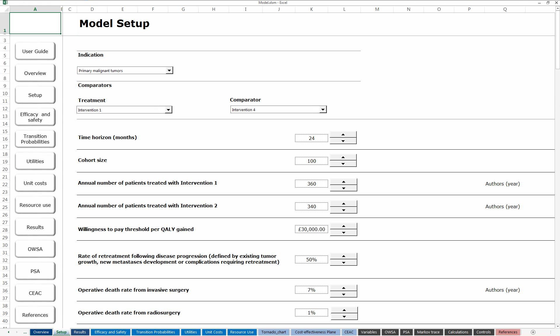
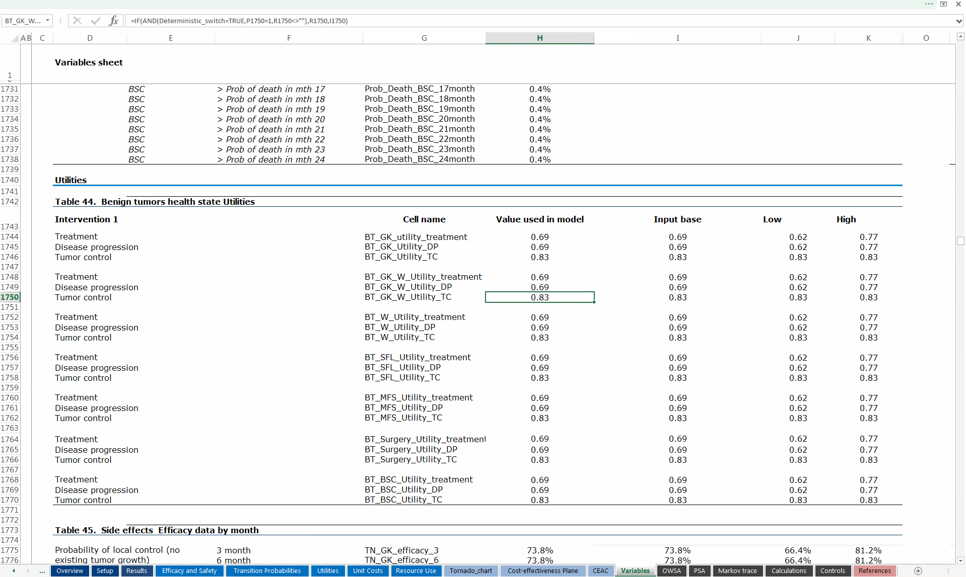
Microsoft Excel. Panel (a) shows the spreadsheet in which the user can modify the value of (some of the very many!) parameters, either typing in the cells or using drop-down menus. Panel (b) shows an excerpt of the spreadsheet in which the values for the relevant variables populating the underlying model are actually stored for computation.
Figure 3.1 shows an example of an Excel model. The file is structured over 18 different spreadsheets using Virtual Basic for Applications (VBA) macros. Typically, it is possible to create shortcuts such as buttons, \(e.g.\) as in the left-hand side of the screen in Figure 3.1 (a), that allow users to navigate through the spreadsheets. Clearly, however, these complex model are not necessarily “easy to use”.
Figure 3.1 (a) shows the spreadsheet in which the user can modify the value of some of the parameters in the model. This can be done either by typing in the cells or by selecting one of a set of allowed options using the drop-down menus. These menus can be again programmed using macros. Typically, this spreadsheet is merely a graphical interface and is not used for calculations of the actual economic model. In fact, when a value is changed it is simply overwritten in one of the cells in one of the other spreadsheets, for example the spreadsheet presented in Figure 3.1 (b).
The interesting thing to note is the size of this spreadsheet: the screenshot shows cells in the range A1731–K1776 (using the standard Excel notation, in which numbers indicate rows and letters indicate the columns of the spreadsheet). This is just an excerpt of the whole spreadsheet and indicates the complexity of this fundamental component of the overall model. Values in the cells of this spreadsheet are linked to other cells in other spreadsheets to actually perform the necessary computations — for example, the highlighted cell H1750 includes the formula
=IF(AND(Deterministic_switch=TRUE, P1750=1, R1750<>""), R1750, I1750)instructing Excel to first check whether:
- the named variable
Deterministic_switch(which, incidentally, is defined in cellP8in the current workspace, namedVariables) is set to the valueTRUEorFALSE; - the value in cell
P1750in the current spreadsheet is equal to 1; - cell
R1750is not empty.
If these three conditions hold, then Excel will copy to cell H1750 the value originally recorded in cell R1750, while if they do not, it will copy the value originally included in cell I1750.
Human error in cross-referencing one of the cells may have dire consequences and produce results that are incorrect. Of course, this is a problem for any modelling procedure, irrespective of the software used to perform the calculations. The additional issue with spreadsheet-based models is that it may be very difficult to debug and search for potential errors, because cross-linking may be difficult to follow when there are many spreadsheets and active cells in each.
3.1.1 Why R?
In line with an increasing number of contributions to the literature (Baio et al., 2025; Baio, 2012; Baio and Heath, 2016; Incerti et al., 2019; Jalal et al., 2017; Williams et al., 2016), we argue that many of these shortcomings can be overcome by doing the whole process using proper statistical software — our choice is of course R — and that the main advantages are
- Scripting facility: the whole analysis can (and should!) be performed by writing scripts instructing the software about the steps necessary for the analysis. This will improve replicability and will provide transparency;
- Graphical facility:
Rhas very good graphical engines (including the defaultbaseand the more advancedggplot2). This guarantees, at virtually no cost, high quality output that can be included in research papers or reimbursement dossiers to be submitted to the regulators; - Statistical facility: models are increasingly complex and involve subtle issues that require careful statistical modelling. As an example, consider survival analysis (incidentally, the vast majority of NICE appraisals is in the cancer area, where survival analysis plays a fundamental role): fitting even the simplest of survival models goes beyond
Excel’s ability; - Computational facility: related to the previous point, some of the most advanced analyses (for example involving “microsimulations” or the analysis of the value of information — see Chapter 4 require a computational engine that, again, is beyond the capability of
Excel.
3.1.2 Why BCEA?
In particular, we consider BCEA, an R package to post-process the results of a Bayesian health economic model and produce standardised output for the analysis of the results (Baio and Berardi, 2013). BCEA is among the first, if not the first R package specifically devoted to economic evaluation of health care interventions — fortunately, a number of other packages followed suit, including, notably (but absolutely not exclusively!): hesim (Incerti and Jansen, 2021), survHE (Baio, 2020), survextrap (Jackson, 2023), voi (Jackson and Heath, 2024).
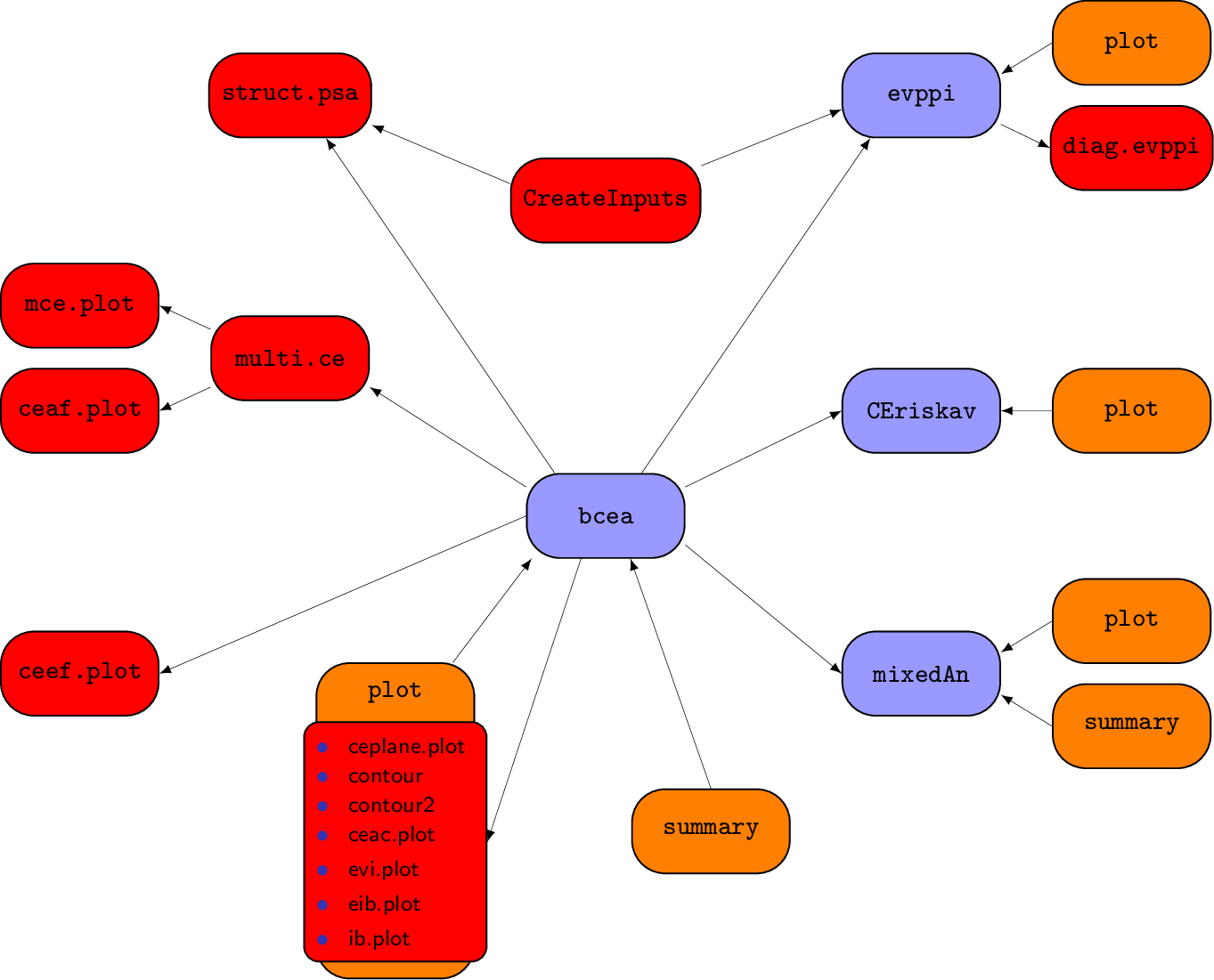
Figure 3.2 shows a schematic representation of the package. In the figure, the purple boxes indicates functions that define specific classes. These are objects in R that allow generic functions (such as print or plot) to adapt, for example, the main function bcea returns as output an object in the class bcea. These generic functions are represented by the orange boxes. Finally, the red boxes identify the functions that are specific to BCEA. In the rest of the book, we present each of these elements and explain how they can be used in the process of statistical analysis of a health economic evaluation problem.
BCEA accepts as inputs the outcomes of a health economic evaluation comparing different interventions or strategies, ideally but not necessarily produced using MCMC (Markov Chain Monte Carlo) methods. It is not a tool to perform the evaluation itself, but rather to produce readable and reproducible outputs of the evaluation. It also provides many useful, technically advanced measures and graphical summaries to aid researchers interpret their results.
In general, BCEA requires multiple simulations from an economic model that compares at least two different interventions based their cost and effectiveness measures to produce this standardised output. The cost measure quantifies the overall costs associated with the interventions for every simulation. The effectiveness, or efficacy, measure can be given in any form, be it a “hard” outcome (\(e.g.\) number of avoided cases) or a “soft” one (\(e.g.\) QALYs, Quality-Adjusted Life Years).
Thus the minimum input which must be given to BCEA is composed of two \(n_{\text{sim}} \times n_{\text{int}}\) matrices, where \(n_{\text{sim}}\) is the number of simulations used to perform the analysis (at least 2) and \(n_{\text{int}}\) is the number of interventions being compared (again, at least 2 are required). These two matrices contain all the basic information needed by BCEA to perform a health economic comparison of the alternative interventions.
We assume, in general, that the statistical model underlying the economic analysis is performed in a fully Bayesian framework. This implies that the simulations for the economic multivariate outcome \((e,c)\) are in fact from the relevant posterior distributions. We discuss in Chapter Chapter 5 how BCEA can be used alongside a non-Bayesian model.
To illustrate the capabilities of BCEA, the two examples are introduced in Section 3.2.1 and Section 3.2.2 are developed as full health economic evaluations throughout the book. Both these examples are included in the BCEA package and therefore all the results throughout the book can be replicated using these datasets. Each of the following sections detail a different function in BCEA demonstrating its functionality for both single and multi-comparisons examples.
All plots in the BCEA package can be produced either using three different graphics engines: base graphics (the default), ggplot2 or plotly. ggplot2 (Wickham, 2009), part of Hadley Wickham’s tidyverse(Wickham et al., 2019), is a an R package for producing beautiful and high-quality plots based on the Grammar of Graphics (Wilkinson et al., 2013), allowing fine control over each individual structured element. Plots created using ggplot2 return objects which can be modified after having been created, unlike those made with base graphics. plotly extends the range of outputs even further by allowing users to create interactive graphics for HTML documents, including shiny applications (Chang et al., 2015). plotly is another implementation of the grammar of graphics, and is powered by the JavaScript graphing library plotly.js (Sievert, 2020). While ggplot2 can be preferable for static plots, plotly is specifically aimed at allowing user interactions with the outputs by allowing display of information by hovering over data series, selecting or deselecting data series directly from the legend, and the implementation of additional interactive manipulation of characteristics (such as the colour of a cloud of points) linking arguments passed to the plotting functions to HTML widgets in shiny applications.
Selecting the graphics engine in the BCEA functions is standardized via the graph argument. The three options can be selected by specifying graph="base" (the default option), graph="ggplot2" or graph="plotly". Partial-matching is also available, e.g., graph="g" will select ggplot2. While structurally the plots are similar between the three engines, some of the parameters will vary across the engines; the differences are described both in the worked examples throughout the following sections, as well as in the function documentation.
The selection of the optimal engine is up to the BCEA user, and should be mostly guided by the type of output to be generated. The base graphics are the most immediate and faster to generate; ggplot2 produces higher-quality static images and is a better choice for publication-level outputs. For interactive HTML outputs, plotly should be considered. It is worth noting that plotly also includes a ggplotly() function that can convert most ggplot2 graphics into interactive objects, but comes at a cost of some of the finer controls.
Due to the static nature of this book, only the base and ggplot2 versions are presented and discussed in detail.
3.2 Economic Analysis: the bcea function
If a health economic model has been run in a similar manner to the two examples discussed in Chapter 2 then, in general, the modeller will have access to two matrices, which we denote by eff and cost. These matrices contain the simulated values of the effectiveness and costs, associated with the interventions \(t=1,\dots, T\), where \(T\) is the total number of treatments, equal to 2 for the Vaccine example and 4 for the Smoking cessation example. The generic element of position \([s,t]\) in each matrix is the measurement of the outcome observed in the \(s-\)th simulation, with \(s=1,\dots, S\), where \(S\) is the number samples, under intervention \(t\), with \(t=1, \dots, T\). In both examples, we set \(S=1\,000\).
To begin any analysis using the package BCEA, the bcea function must be called. This function processes the matrices for the costs and effectiveness so that the model output is in the correct form for other functions in the package BCEA. Additionally, the bcea object can be used to give basic summaries and plots. Therefore, when this function is called it should be assigned an object, to create an object of class bcea. This object contains the following elements which are then used as inputs to the other functions in the BCEA package. A bcea object contains the following elements:
n_sim: the number of model simulations, \(i.e.\) the number of rows of theeffandcostmatrices given as arguments to thebceafunction;n_comparators: the total number of interventions included in the model, \(i.e.\) 4 for the smoking cession example;n_comparisons: the total number of possible pairwise comparisons versus the reference intervention. It is equal ton_comparators\(-1\);delta_e: a matrix withn_simrows andn_comparisonscolumns, including as elements for each row the simulation-specific differences in the clinical benefits between the reference comparator and the other comparators;delta_c: a matrix withn_simrows andn_comparisonscolumns, including as elements for each row the simulation-specific differences in the costs between the reference comparator and the other comparators;ICER: a vector of lengthn_comparisonsincluding the ICER for the comparison(s) between the reference intervention and the other comparators (see Section 1.3);Kmax: the value of theKmaxargument given to the functionbcea, equal to the maximum willingness to pay (see Section 3.2.2). This is ignored if the optionwtpis passed as an argument to thebceafunction.k: a vector specifying the grid approximation of the willingness to pay to be used in the calculations. Thekparameter can be passed to the functionbceaspecifying the argumentwtpas a numeric vector of willingness to pay thresholds of interest.bceawill also accept a scalar for the inputwtp, in which case the analysis is performed assuming a single value for the willingness to pay threshold. The default behaviour ofbceais to build a 501-element from \(0\) toKmax;ceac: a matrix with a number of rows equal to the length ofkandn_comparisonscolumns. The elements are the value of the pairwise cost-effectiveness acceptability curve as a function of the willingness to pay gridkfor each comparison with the reference intervention (see Section 4.2.2);ib: a three-dimensional array with size for the first dimension equal to the length of the vectork, second dimension equal ton_simand third dimension given byn_comparisons. The elements of the arrayibare the values of the incremental benefit for each willingness to pay for every simulation by comparisons. If only two comparators are included in the model (like in the vaccine example), it is a matrix with rows equal to the length ofkandn_simcolumns;eib: a matrix with rows given by the length ofkandn_comparisonscolumns reporting the values of the expected incremental benefit as a function of the willingness to pay thresholds (see Section 3.5). If only one comparison is included in the analysis, it will be a vector, with length equal to the length ofk;kstar: a vector including the grid approximation of the break-even point(s), if any. Sincekstaris calculated on the vectork, its precision depends on the density of the grid approximation of the willingness to pay values;best: a vector with the same length ask, indicating the ‘’best’’ intervention for every willingness to pay threshold included in thekgrid. The ‘’best’’ intervention is the one maximising the expected utilities for each threshold value;U: an array of dimensionn_simx the length ofkxn_comparatorsincluding the value of the expected utility for each simulation from the Bayesian model, for each value of the grid approximation of the willingness to pay and for each intervention being considered;vi: a matrix withn_simrows and columns equal to the length ofkincluding the value of information for each simulation from the Bayesian model and for each value of the grid approximation of the willingness to pay (see Section 4.2.1);Ustar: a matrix withn_simrows and columns equal to the length ofk, indicating the maximum simulation-specific utilities for every value included in the willingness to pay grid;ol: the opportunity loss value for each simulation and willingness to pay value, reported as a matrix withn_simrows and a number of columns equal to the length of the vectork(see Section 4.2.1);evi: a vector with the same number of elements ask, with the expected value of (perfect) information for every considered willingness to pay threshold as values (see Section 4.3);ref: the numeric index associated with the reference intervention;comp: the numeric index(es) associated with the non-reference intervention(s);step: the step used to form the grid approximation of the willingness to pay grid, such that a 501-element grid of values is produced with 0 andKmaxas the extreme values. Ignored ifwtpis passed as an argument to thebceafunction;interventions: a vector of lengthn_comparatorswith the labels given to each comparator;e: the matrix including the simulation-specific clinical benefits for each comparator used to generate the object;c: the matrix including the simulation-specific costs for each comparator used to generate the object.
These items in the bcea object are sub-settable as in lists, \(i.e.\) the command object$n_sim will extract the first element of the bcea object.
3.2.1 Example: Vaccine example
To use the Vaccine dataset included in the package BCEA, it is sufficient to load BCEA using the function library, and attaching the dataset with the command data(Vaccine). Doing so will import in the current workspace all the variables required to run the analysis.1
library(BCEA)
data(Vaccine)
ls()
[1] "c.pts" "compile_book" "cond.table" "cost"
[5] "cost.GP" "cost.hosp" "cost.otc" "cost.time.off"
[9] "cost.time.vac" "cost.travel" "cost.trt1" "cost.trt2"
[13] "cost.vac" "e.pts" "eff" "make_index"
[17] "money" "N" "N.outcomes" "N.resources"
[21] "QALYs.adv" "QALYs.death" "QALYs.hosp" "QALYs.inf"
[25] "QALYs.pne" "treats" "vaccine_mat" "write_tikz" The definition of each object included in the Vaccine dataset is discussed in the package documentation by executing the command ?Vaccine in the R console. At this point we can begin to run the health economic analysis by using the bcea function to format the model output. The package BCEA needs to be loaded if this was not done earlier using the function library. A suitable vector of labels for the two interventions can be defined (this step is optional) and the function bcea is then called where the matrices eff and cost are the effectiveness, in terms of QALYs, and the costs for the Vaccine example.
treats <- c("Status quo", "Vaccination")
m <- bcea(eff, cost, ref=2, interventions=treats)
If no labels are passed and the option interventions is not explicitly considered, BCEA will create labels of the type "Intervention 1", ..., "Intervention T", with T \(=2\) in this case, indicating the number of compared interventions.
The option ref=2 instructs R to consider the second intervention (\(i.e.\), the one for which the values of the cost and effectiveness measures feature in the second column of the matrices cost and eff) as the “reference” intervention. Thus, \(t=2\) is considered as the intervention being assessed against the standard \(t=1\). If no explicit option is specified, BCEA assumes that the first intervention is the reference instead and treats all the others as comparators.
This command produces a bcea object assigned to m in the code above. If the argument plot is set to TRUE, the function bcea creates a graph showing the main results (see Figure 3.3). By default, the graph is not created, which is equivalent to setting the option to FALSE. It is possible to produce the summary graph when the economic evaluation is run or anytime after that, using the command plot(m), where m is a bcea object.
### Run the HE analysis and produce summary graph
m <- bcea(e=eff, c=cost, ref=2, plot=FALSE)
### Produce the summary graph from the bcea object
plot(m)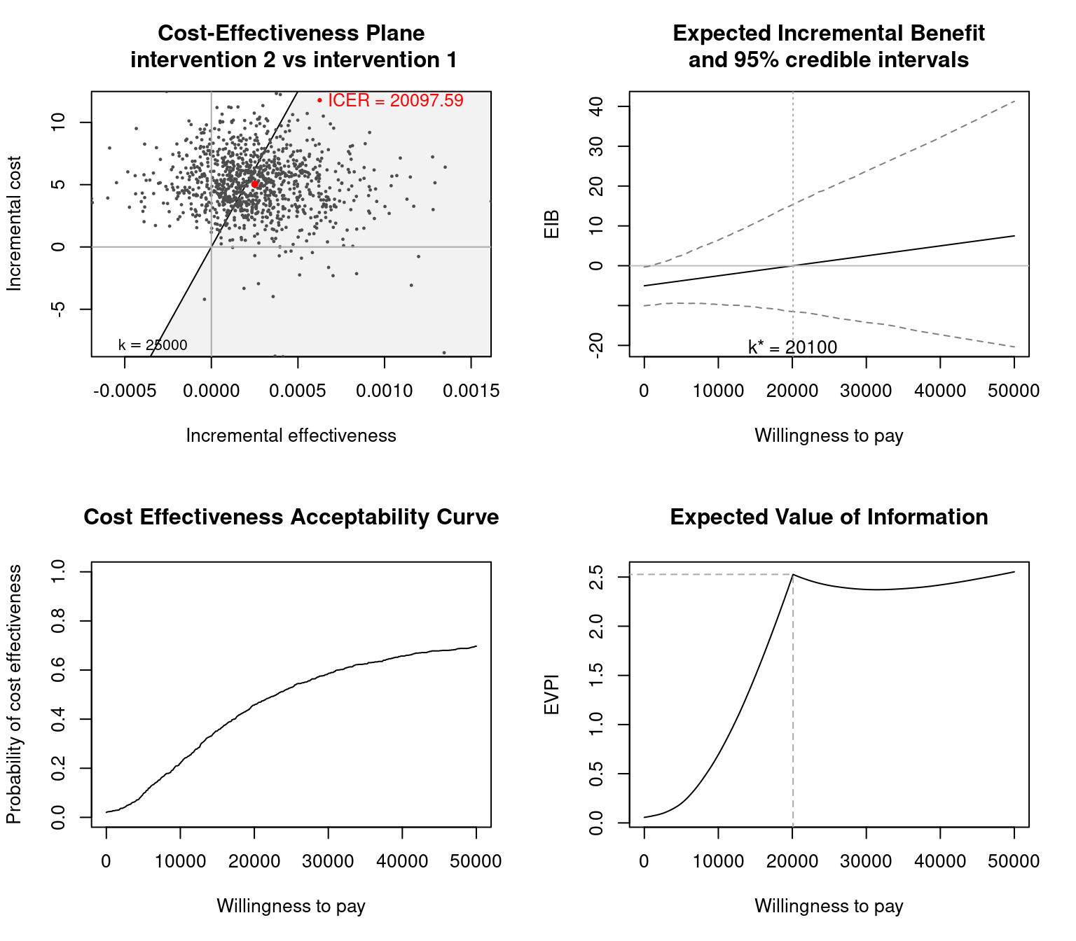
BCEA by setting the option plot=TRUE or by calling the function plot with a valid BCEA object as its argument. From the top-left corner, clockwise, it includes: the cost-effectiveness plane Section 3.4, the expected incremental benefit Section 3.5, the cost-effectiveness acceptability curve Section 4.2.2 and the expected value of perfect information Section 4.3.1.
Note that plot is an S3 method for the bcea class of object and therefore help for this function is accessed using ?plot.bcea.
As mentioned earlier, the input data for the population average measure of cost and effectiveness are ideally obtained from a full Bayesian model, as in the example just described. Nevertheless, BCEA can also accommodate data on \((e,c)\) obtained under a frequentist approach, \(e.g.\) using bootstrap. Perhaps, these are available in a spreadsheet (we return to this point repeatedly in the rest of the book, \(e.g.\) in Section 4.3.2, Section 5.2.6.1 and Section 5.2.7, say the file Bootstrap.csv in which the first two columns are the simulations for the measure of effects for the two treatments considered, while the data in columns three and four are the corresponding values for the measure of cost. In such a situation, we could import these to R as follows.
# Imports the spreadsheet
# (assuming the file is in the working directory.
#  If not, need to change the path!)
inputs <- read.csv("data/Boostrap.csv")

# Take a look at the resulting object
head(inputs)
QALYs.for.t.0 QALYs.for.t.1 Costs.for.t.0 Costs.for.t.1
1 -0.001314023 -0.001436215 12.560492 18.163893
2 -0.001379822 -0.001011358 11.371500 16.024182
3 -0.000778252 -0.000456531 7.113610 13.012624
4 -0.000978127 -0.000583102 7.422760 13.025927
5 -0.000530283 -0.000590798 4.313992 9.971295
6 -0.001150927 -0.000704177 11.839145 14.955694Crucially, the object inputs is automatically created in the R workspace as a data.frame — not a matrix. This means that if we try to feed the relevant columns to BCEA as the values for the arguments eff and cost, we get an error message.
# Creates objects e,c with the relevant columns of inputs
eff <- inputs[, c(1:2)]
cost <- inputs[, c(3:4)]

# And then use these to launch BCEA
m <- BCEA::bcea(eff, cost)
Error:
! eff and cost must be matrices.To avoid this problem, we need to change the class of the simulated values, so that eff and cost are matrices, for example using the following code.
# Check the class of the objects
class(inputs)
[1] "data.frame"# [1] "data.frame"
class(eff)[1] "data.frame"# [1] "data.frame"
class(cost)[1] "data.frame"# [1] "data.frame"
# Re-create the objects eff and cost as matrices and check the class
eff <- as.matrix(inputs[, c(1:2)])
cost <- as.matrix(inputs[, c(3:4)])
class(eff)[1] "matrix" "array" # [1] "matrix"
class(cost)[1] "matrix" "array" # [1] "matrix"
# Now re-run BCEA
m <- bcea(eff, cost)3.2.2 Example: Smoking
To use the Smoking dataset included in the package BCEA, the data set must be loaded in a similar fashion to the Vaccine data set using data(Smoking). This will import the Smoking data set into the current workspace. Note that the effectiveness and cost matrices are called eff and cost in both examples; therefore, the eff and cost objects will be overwritten if the datasets are loaded in the same R session one after the other.
To run the economic analysis using BCEA, the ‘’Group counselling’’ intervention is chosen as the reference intervention. Since this intervention is associated with the fourth column of the effectiveness and cost matrices, it is selected by specifying ref=4. To read the outputs more easily, the intervention labels are passed to the function as well.
library(BCEA)
data(Smoking)
treats <- c("No intervention","Self-help",
            "Individual counselling","Group counselling")
m <- bcea(eff, cost, ref=4, interventions=treats, Kmax=500)
By default, bcea produces the analysis on a discrete grid of willingness to pay thresholds, creating a vector of 501 equally spaced values in the interval between \(0\) and the value given to the argument Kmax in the bcea function (the default value is set at 50,000 monetary units). This implies that the vector of thresholds produced will be \(\{0,100,\ldots,49900,50000\}\). For the Smoking example, this upper extreme is modified by setting Kmax to 500. This limit has been reduced as the interest is not focused on QALYs but rather on life years gained, and the ratios of costs to effectiveness are much lower than in a standard health economic analysis, since the interventions are relatively inexpensive. Selecting an appropriate maximum value of the willingness to pay allows for a finer analysis of the variations by threshold, since the values are computed over a fixed-length grid. In other words, using a narrower willingness-to-pay interval results in an analysis based on smaller increments of the cost-per-outcome threshold.
In general, the grid approximation of the willingness to pay values can be customised still further by the user, by passing a numeric vector as the k argument. This was formerly the wtp argument, which has been deprecated. For example to produce an evaluation of the measures only at the threshold values \(20\,000\), \(25\,000\) and \(30\,000\) monetary units per unit increase in outcome, the function can be called as in the code below.
m <- bcea(eff = eff, cost = cost, ref=4, k=c(20000,25000,30000), plot=FALSE)Additionally, notice that no restrictions are applied to the values passed as the wtp argument. The vector elements need to be at least one, and if any of them is negative the values are re-scaled by incrementing all values by the absolute value of the lowest element (\(i.e.\) passing the argument wtp=c(-5,5) will produce an analysis over the values \(0\) and \(10\)).
The standard BCEA plot, obtained using plot(m) and demonstrated for the Vaccine example, can be cluttered when multiple comparators are included in the analysis. For this reason, all plots in the BCEA package can be produced either using base graphics (the default) or ggplot2, an advanced plotting system based on the grammar of graphics (Wickham, 2009) which is preferred for multiple comparators as ggplot2 allows for finer controls over the graphs.
To select the ggplot2 version of the plot, the option graph="ggplot2" must be added to the plot or plot.bcea function call. The string is partial-matched to either ggplot2 or base, hence selecting graph="g" or "b" is sufficient to indicate which graphical engine should be used. The two versions of the graphs share the same function calls, and are selected by the use of the graph option only. The graphical results have been kept as consistent as possible between the two versions.
Adding the option graph="ggplot2" to the plot function will produce a ggplot2 object which, if not assigned to a named object, will be printed by default. It is possible to store the plot in an object, modify it and produce the graph using the functions print or plot, via the S3 methods for the class ggplot2 (\(i.e.\) print.ggplot and plot.ggplot).
In general, the ggplot2 versions of the plots extend the amount of options available using graph="base", and the modularity of ggplot2 objects allows for post-hoc modifications as well. In Figure 3.4, the position of the legends is set to the bottom of the graphs, outside the plot area. The argument ICER_size is set to 2 and passed to the ceplane.plot function (see Section 3.4) to include the ICERs in the cost-effectiveness plane. The code used to produce Figure 3.4 is reported below.
library(ggplot2)
plot(m, graph="ggplot2", wtp=250, pos="verticalbottom", ICER_size=2)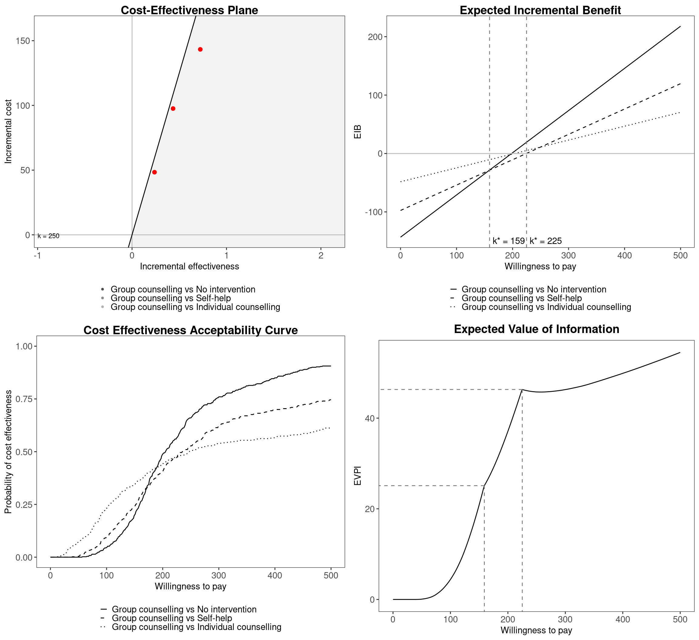
ggplot2 version of plot.bcea. The different colours and line types indicate the three pairwise comparisons versus the status quo (No intervention). The two willingness to pay values in correspondence of which the decision changes are represented in the expected incremental benefit (EIB) and expected value of perfect information (EVPI) plots. An arbitrary willingness to pay, equal to £250 per life year saved, has been chosen for the cost-effectiveness plane graph.
The interpretation of these 4 graphics and their manipulation in both base graphics and ggplot2 graphics will be dealt with in the following sections; the cost-effectiveness plane in Section 3.4, the expected incremental benefit in Section 3.5, the cost-effectiveness acceptability curve in Section 4.2.2 and the expected value of perfect information in Section 4.3.1.
3.3 Basic health economic evaluation: the summary command
A summary table reporting the basic results of the health economic analysis can be obtained from the BCEA object using the summary function. This is an S3 method for objects of class bcea, similar to the plot function applied to produce the graphical summary. It produces the following output for the Vaccine example:
summary(m)
Cost-effectiveness analysis summary

Reference intervention:  Vaccination
Comparator intervention: Status quo

Optimal decision: choose Status quo for k < 20100 and Vaccination for k >= 20100


Analysis for willingness to pay parameter k = 25000

            Expected net benefit
Status quo               -36.054
Vaccination              -34.826

                             EIB  CEAC  ICER
Vaccination vs Status quo 1.2284 0.529 20098

Optimal intervention (max expected net benefit) for k = 25000: Vaccination

EVPI 2.4145
By default, bcea performs the analysis for a willingness to pay of \(k=25\,000\) monetary units2, say pounds sterling. The threshold can be easily modified by using the command summary(m, wtp=value), where value is the willingness to pay specified by the user.
If the willingness to pay specified using wtp=value in the call to the function summary is not included in the grid (which can be accessed by typing m$k), an error message will be produced. For example, using the command summary(m, 1234) will result in the following output:
Code
summary(m, 1234)Error:
! The willingness to pay parameter is defined in the interval [0-50000], with increments of 100The summary table displays the results of the health economic analysis, including the optimal decision over a range of willingness to pay thresholds, identified by the maximisation of the expected utilities. In this case the break-even point, the threshold value \(k\) in correspondence of which the decision changes, is individuated at \(20\,100\) monetary units. The summary also reports the values for the EIB (Section 3.5), CEAC (Section 4.2.2) and EVPI (Section 4.3.1) for the selected willingness to pay threshold, along with the ICER.
In the Vaccine example, the ICER is below the threshold of \(25\,000\) and thus the vaccination policy is cost-effective in comparison to the status quo. A more in-depth explanation of the probabilistic sensitivity analysis and the tools provided by BCEA to interpret and report it (\(e.g.\) the CEAC and the EVPI) is deferred to Chapter Chapter 4.
Running the analysis for a different willingness to pay, for example \(k=10\,000\), may result in a different optimal decision, depending on whether the ICER is above or below the selected willingness to pay. If this new threshold were selected for the Vaccine case, the ICER would now be above it and thus the decision taken in this scenario would be associated with less uncertainty. In fact the ICER is estimated at \(20\,098\) monetary units, twice the value of the willingness to pay threshold selected in this case (but notice that the summary reports the grid estimate of \(20\,100\)).
summary(m, wtp=10000)
Cost-effectiveness analysis summary

Reference intervention:  Vaccination
Comparator intervention: Status quo

Optimal decision: choose Status quo for k < 20100 and Vaccination for k >= 20100


Analysis for willingness to pay parameter k = 10000

            Expected net benefit
Status quo               -20.215
Vaccination              -22.745

                              EIB CEAC  ICER
Vaccination vs Status quo -2.5302 0.22 20098

Optimal intervention (max expected net benefit) for k = 10000: Status quo

EVPI 0.6944
For the Smoking example, the default summary is given for Kmax. However, as above, the willingness to pay value can be changed from this default, using the wtp argument:
summary(m, wtp=250)The summary table shows that, based on the expected incremental benefit, the optimal decision changes twice over the chosen grid of the willingness to pay values. Below a threshold of willingness to pay equal to £177 per life year gained, the optimal decision is No treatment. For values of the willingness to pay between £177 and £210 per life year gained, the most cost-effective decision would be the Self-help intervention. For thresholds greater than £210 the optimal strategy is Group counselling. Notice that Individual counselling is dominated by the other comparators at the willingness-to-pay values considered. The break-even points are relatively low in value, indicating that the introduction of smoking cessation interventions would be cost-effective compared to the null option (No treatment).
Due to the multiple treatment options, this summary table is more complex than the summary for the Vaccine example. The ICER is given for the three comparison treatments, compared with Group Counseling. The EIB and CEAC are also given for these pairwise comparisons. Finally, note that there is only one value given for the EVPI (see Section 4.3.1). This is because the EVPI relates to uncertainty underlying the whole model rather than the paired comparisons individually; we return to this idea in Section 4.3.1.2.
3.4 Cost-effectiveness plane
The summary table produced using the summary function already provides relevant information about the results of the economic analysis; however, a graphical representation of the results can indicate behaviours or particular characteristics that may be missed from the analysis of the summary indexes. The first and probably most important representation of the data is the cost-effectiveness plane (which incidentally is recommended by most health technology assessment agencies as a necessary tool for economic evaluation). The cost-effectiveness plane, discussed in Section 1.3 and Figure 1.4, is a visual description of the incremental costs and effects of an option compared to some standard intervention (Baio, 2012).
3.4.1 The ceplane.plot function
The ceplane.plot function is used to produce the cost-effectiveness plane from a BCEA object, and it is plotted by default in the graphical summary accessible via the S3 function plot.bcea. To produce the cost-effectiveness plane from a BCEA object m, it is sufficient to execute the following command:
ceplane.plot(m)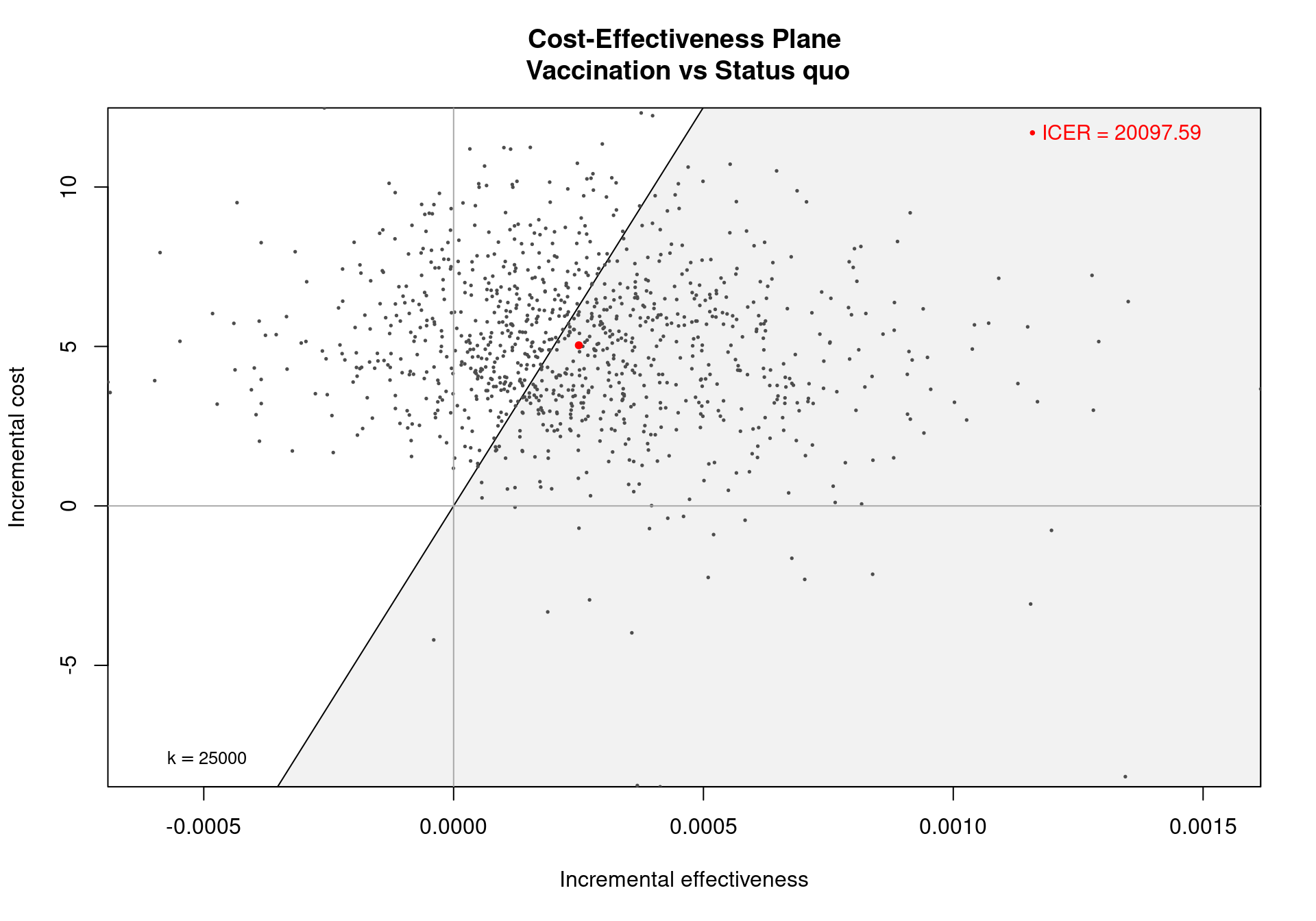
In Figure 3.5, the cost-effectiveness plane for the Vaccine example, the dots are a representation of the differential outcomes (effectiveness and costs) observed in each simulation. If a dot falls in the sustainability area shaded in grey, it indicates that the expected incremental benefit for the comparison is positive for the given simulation and chosen willingness to pay threshold. The red dot is a representation of the ICER on the cost-effectiveness plane and is obtained as the averages of the two marginal distributions (for \(\Delta_e\) and \(\Delta_c\)). The numerical value of the ICER is printed in the top-right corner by default, while the willingness to pay threshold (\(k\)) is displayed in the bottom-left corner. This gives he gradient of the line partitioning the plane and defines the cost-effectiveness acceptability (sustainability) region.
Several options are available for this function. The willingness to pay can be adjusted by setting the option wtp to a different value, \(i.e.\) wtp=10000, which will change the slope of the line, varying the value assigned to \(k\) in the equation \(\Delta_c=k \Delta_e\) defining the acceptability region. The willingness to pay is defined in the interval \([0, \infty)\), and any value in this range can be assigned to this argument, \(0\) included. Assigning a negative value to wtp will generate an error. In this case, note that, the selected value for wtp does not have to be in the grid defined by the element m$k.
The position of the ICER label can be adjusted by using the pos argument, placing the legend in any chosen corner of the graph. This can be done by setting the parameter pos to the different values topright (the default), topleft, bottomright or bottomleft. It is also possible to assign a two-dimensional numerical vector to this argument. A value equal to 0 in the first element positions the label on the bottom, while a 0 as the second element of the vector indicates the left side of the graph. If the first and/or second elements are not equal to zero, the label is positioned on the top and/or on the right, respectively.
In case more than two interventions, like for the Smoking example, the argument comparison can be used to select which pairwise comparisons to visualise on the plane. For example, the following code will plot the cost-effectiveness plane for Group Counselling (reference treatment) against Self-Help (treatment 2).
ceplane.plot(m, comparison=2, wtp=250)It is also possible to add more than one treatment comparison by setting comparison as a vector, \(e.g.\)
ceplane.plot(m, comparison=c(1,3), wtp=250)The values in this vector must be valid indexes, \(i.e.\) they need to be integer positive numbers between \(1\) and the number of non-reference comparators, 3 for the Smoking example. If this number is not known, the number of non-reference comparators included in a BCEA object m is stored in the element n.comparisons of the object, accessible using the command:
m$n_comparisons[1] 3Note that if more than 1 pairwise comparisons are plotted then the ICER and sustainability area cannot be plotted using the default graphics package.
3.4.2 ggplot2 version of the cost-effectiveness plane
To add these elements to the graphic, the ggplot2 graphics package must be used. This package also allows the user to have more control over the plot which is useful in situations where the cost-effectiveness plane must conform to certain publications standards.
In multi-decision problems the acceptability area is included by default in the ggplot2 cost-effectiveness plane. The ICER, on the other hand, is not included by default but this can be included using the argument ICER_size. This displays the ICERs with a size in millimetres. The following code produces Figure 3.6, which includes the 3 pairwise ICERs of size \(2\)mm and a non-default acceptability area with a willingness to pay for \(250\) monetary units.
ceplane.plot(m, wtp=250, graph="ggplot2", ICER_size=2)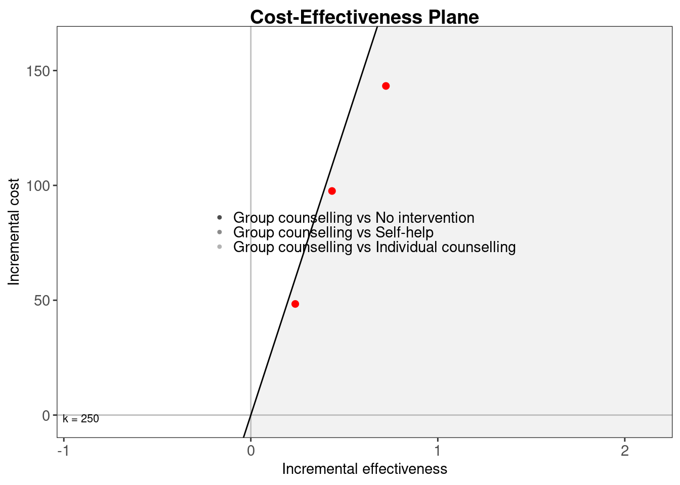
ceplane.plot function by setting the argument graph to ggplot2. The theme applied in the graph is a modified version of theme_bw to keep consistency between this version and the one using base graphics. The output of the function is a ggplot2 object.
The results from Figure 3.6 indicate that the three pairwise comparisons – represented by the three different clouds of points – are similar in terms of variability. The distance from one to the next seems similar in terms of increments of the differential costs and effectiveness. Clearly, the most effective and costly intervention on average is Group counselling, indicated by all three ICERs residing in the top left quadrant. This is followed by Individual counselling and Self-help. The No intervention option is obviously the least expensive strategy, with no costs to be borne but also has the smallest probability of success. Note also that, the costs are therefore directly proportional to the efficacy for all comparators, making Self-help the least expensive direct intervention but also the least effective among the three active interventions. Individual counselling is between Self-help and Group counselling for both outcomes.
All options presented in Section 3.4.1 are compatible with the ggplot2 cost-effectiveness plane, but the opposite is not always true. In addition to the base plot manipulations, it is possible to use the size option to set the value (in millimetres) of the size of the willingness to pay label. A null size (\(i.e.\) size=0) can be set to avoid the label from being displayed. Depending on the distribution of the cloud of points and the chosen willingness to pay threshold, the default positioning algorithm for the willingness to pay label can result in a non-optimal result, in particular when the acceptability region limit crosses the left margin of the plot. An alternative positioning can be selected by setting the argument label.pos=FALSE in the ceplane.plot function call. This option will place the label at the bottom of the plot area.
For the Vaccine example, the ICER value is printed on the cost-effectiveness plane. For a model with only two decisions the ICER, is also given of the ggplot2 version on the cost-effectiveness plane. The ICER legend positioning works slightly differently for the ggplot2 version and is in general less restrained than in the base graphics plot. It is possible to place it outside the plot limits with assigning the values "bottom", "top", "right" or "left" (with quotes) to the pos argument. Alternatively it can be drawn inside the plot limits using a two-dimensional vector indicating the relative positions ranging from 0 to 1 on the \(x\)- and \(y\)-axis respectively, so for example the option pos=c(0,1) will put the label in the top-left corner of the plot area, and pos=c(0.5,0.5) will place it at the center of the plot. The default value is set to FALSE, indicating that the label will appear in the top-right corner of the plot area, in a slightly more optimised position than setting pos=c(1,1). Setting the option value to TRUE will place the label on the bottom of the plot.
In the case of multiple comparisons, the legend detailing which intervention is represented by which cloud of points – seen on the same plot for the Smoking example – can be manipulated in a similar fashion to the ICER label for the single comparison model. However, for multiple decisions the two commands, pos="bottom" and pos=TRUE differ, the first uses a horizontal alignment for the elements in the legend, the latter will stack them vertically.
In addition to the options presented above, it is possible to modify the graph further thanks to the flexibility given by the ggplot2 class. As an example, the default ggplot2 plot grid can be displayed by adding the associated theme option to the graph object.3 The modified graph can be produced by the following line and shown in Figure 3.7.
ce.plot <- ceplane.plot(
  m, graph="ggplot2", label.pos=TRUE, pos="verticalbottom") +
  theme(panel.grid = element_line(),
        panel.ontop = TRUE,  # grid lines on top of everything else
        panel.background = element_rect(fill = "transparent"))
ce.plot
The layers of the plot can be removed, added or modified by accessing the layers element of the ggplot2 object. For a pairwise comparison, the object will be composed of 7 layers: the line and the area defining the acceptability region, two layers containing the two axes, the points representing the simulations, the legend and finally the willingness to pay label. These elements can be accessed with the command:
ce.plot$layers$geom_polygon
mapping: x = ~.data$x, y = ~.data$y
geom_polygon: na.rm = FALSE, rule = evenodd, lineend = butt, linejoin = round, linemitre = 10
stat_identity: na.rm = FALSE
position_identity
$geom_point
geom_point: na.rm = FALSE
stat_identity: na.rm = FALSE
position_identity
$geom_hline
mapping: yintercept = ~yintercept
geom_hline: na.rm = FALSE
stat_identity: na.rm = FALSE
...Thus it is possible to modify the plot post hoc, by removing, adding or modifying layer elements. For example, to produce a plot of the plane excluding the cost-effectiveness acceptability area it is sufficient to execute the following code, which will produce the plot in Figure 3.8.
# remove layers 1, 2 and 7 from the ggplot object
ce.plot$layers <- ce.plot$layers[-c(1,2,7)]

# print the plot
plot(ce.plot)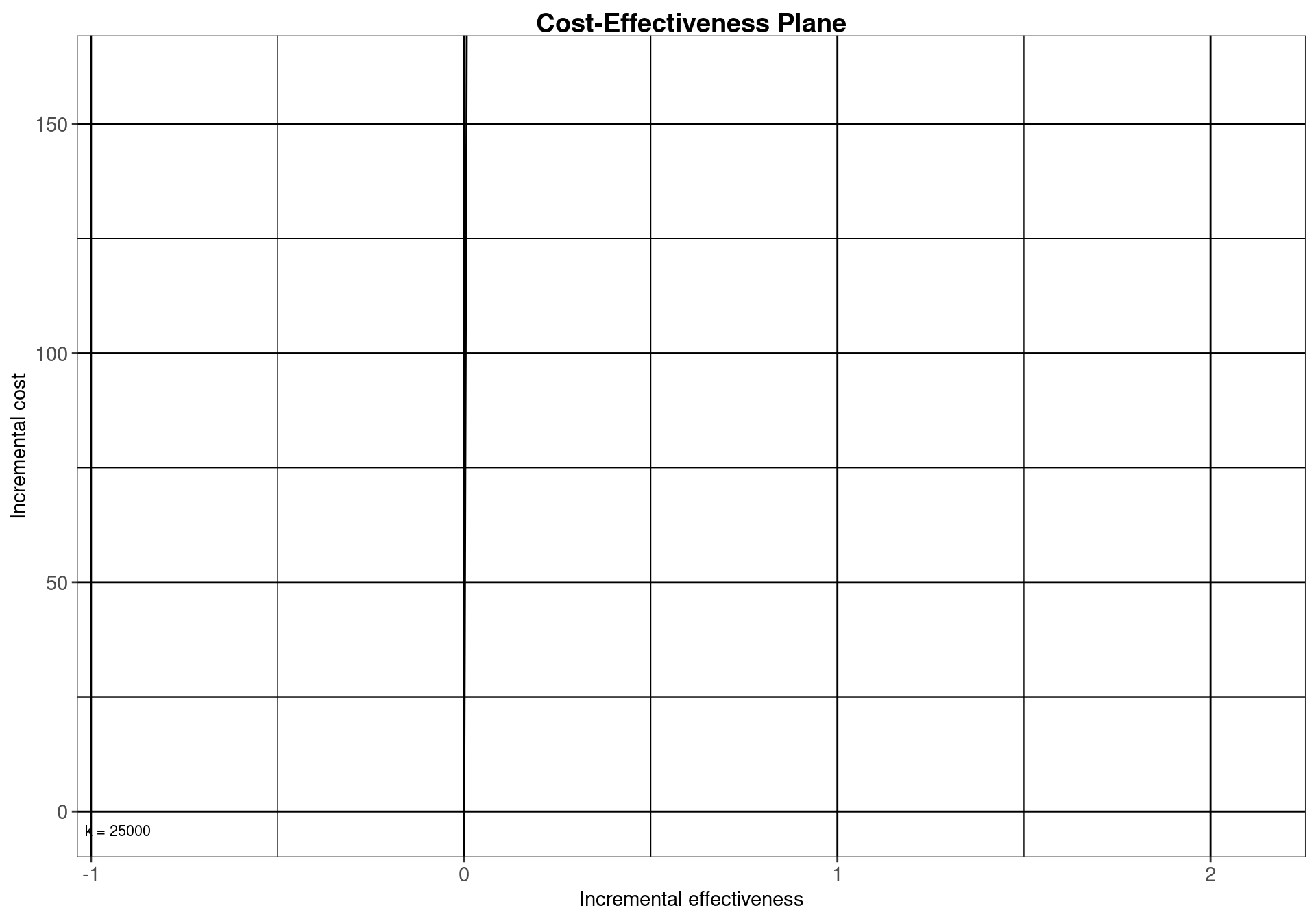
ggplot2 object properties. The cost-effectiveness acceptability region and the willingness to pay label have been removed, and a panel grid has been included. The modularity of this class of objects allows for a high degree of personalisation of the final appearance.
3.4.3 Advanced options for ceplane.plot
The function ceplane.plot also contains some advanced options which allow the user to customise the appearance of the resulting graph even further. In particular, it is possible to pass the optional inputs xlab="string" where "string" is a text string containing the label that the user wants to put on the \(x-\) axis, instead of the default "Incremental effectiveness". Similarly, it is possible to pass an argument ylab="string", which replaces the default string "Incremental cost" for the \(y-\)axis. Finally, the option title="string" instructs BCEA to print a customised title for the graph. An example of advanced use for this function is the following:
ceplane.plot(m, xlab="Difference in QALYs",
             ylab="Difference in costs (Pounds)",
             title="C-E plane")
In addition, it is possible to modify the \(x-\) and \(y-\)axes limits using the option xl=c(lower,upper) and yl=c(lower,upper), where lower and upper are suitable values (these can of course be different for two axes).
3.5 Expected incremental benefit
The expected incremental benefit (EIB) is a summary measure useful to assess the potential changes in the decision under different scenarios (see Section 1.3). When considering a pairwise comparison (\(e.g.\) in the simple case of a reference intervention \(t=1\) and a comparator, such as the status quo, \(t=1\)), it is defined as the difference between the expected utilities of the two alternatives: \[ \mbox{EIB} = \mbox{E}[u(e,c;2)] - \mbox{E}[u(e,c;1)] = \mathcal{U}^2-\mathcal{U}^1. \tag{3.1}\]
In Equation 3.1, \(\mathcal{U}^2\) and \(\mathcal{U}^1\) are synthetic measures of the benefits which the intervention \(t\) is expected to produce. Since the aim of the cost-effectiveness analysis is to maximise the benefits, the treatment with the highest expected utilities will be selected as the “best” treatment option. Thus, if EIB\(>0\), then \(t=2\) is more cost-effective than \(t=1\).
Of course, the expected utility is defined depending on the utility function selected by the decision-maker; when the common monetary net benefit is used, the EIB can be expressed as a function of the effectiveness and cost differentials \((\Delta_e,\Delta_c)\), as in (Section 3.5).
In practical terms, BCEA estimates the EIB using the \(S=\) n_sim simulated values passed as inputs for the relevant quantities \((e,c)\) as
\[\begin{align*} \widehat{\mbox{EIB}} = \dfrac{1}{S}\sum_{s=1}^S [u(e_s,c_s;2)-u(e_s,c_s;1)], %%= \dfrac{1}{S}\sum_{s=1}^S IB(\theta_s) \end{align*}\] where \((e_s,c_s)\) is the \(s-\)th simulated values for the population average measure of effectiveness and costs.
Assuming that the monetary net benefit is used as utility function, this effectively means that BCEA computes a full distribution of incremental benefits \[
\mbox{IB}(\pmb\theta) = k\Delta_e - \Delta_c
\] — recall that \((\Delta_e,\Delta_c)\) are random variables, whose variations are determined by the posterior distribution of \(\pmb\theta\). For each simulation \(s=1,\ldots,S\), BCEA computes the resulting value for \(\mbox{IB}(\pmb\theta)\) and then the EIB can be estimated as the average of this distribution \[
\widehat{\mbox{EIB}} = \dfrac{1}{S}\sum_{s=1}^S \text{IB}(\pmb\theta_s),
\] where \(\pmb\theta_s\) is the realised configuration of the parameters \(\pmb\theta\) in correspondence of the \(s-\)th simulation.
This procedure clarifies the existence of the two layers of uncertainty in the analysis, which is also evident in the cost-effectiveness plane: uncertainty in the parameters is characterised by considering the full (posterior) distribution of the relevant quantities \((\Delta_e,\Delta_c)\). This already averages out the individual variability, but can be further summarised by taking the expectation over the distribution of the parameters, to provide summaries such as the ICER and the EIB.
The value of the IB is accessible from the BCEA object by the function sim.table, detailed in Section 4.2.1. A graphical summary of the distribution of the incremental benefits for pairwise comparisons can be produced using the BCEA command ib.plot, which produces the graph in Figure 3.9.
ib.plot(m)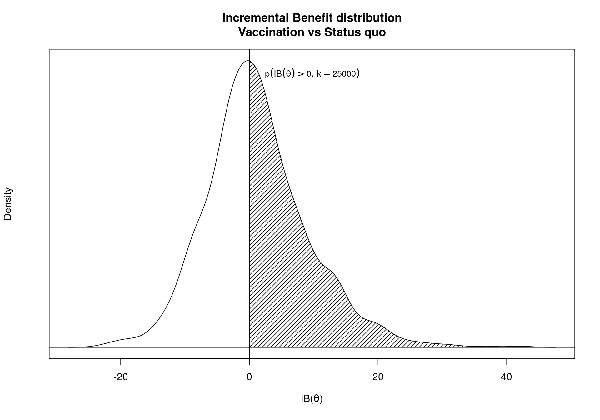
ib.plot function. The shaded area indicates the observed frequency of the incremental benefit being positive for the chosen willingness to pay threshold.
The represented distribution is a Gaussian kernel density approximation of the incremental benefit calculated for each simulation. The kernel estimate can be adjusted using the parameters bw, identifying the kernel smoothing bandwidth, and n, the number of equally spaced points at which the density is to be estimated. These two parameters are passed to the density function available in the stats library. The willingness to pay can be modified by giving a different value the wtp parameter, with \(k=25,000\) as the default. The limits of the \(x\)-axis can be adjusted using the xlim argument, by supplying the lower and upper bound of the axis to be represented as the elements of a two-dimensional vector.
As mentioned in Section 1.3, the EIB can be directly linked with the decision rule applied to the ICER. If a willingness to pay value \(k^*\) exists in correspondence of which \(\mbox{EIB}=0\) this value of \(k\) is called the break-even point. It corresponds to the maximum uncertainty associated with the decision between the two comparators, with equal expected utilities for the two interventions. In other terms, for two willingness to pay values, one greater and one less than \(k^*\), there will be two different optimal decisions.
The expected utilities and the EIB values in correspondence of the chosen willingness to pay are included in the summary table produced by the summary function (see Section 3.3). It is possible to explore how the decision changes over different willingness to pay scenarios, analysing the behaviour of the EIB as a function of \(k\). A graphical summary of the variation of the expected incremental benefit for the Vaccine example is depicted in Figure 3.10, which can be produced by the following command:
eib.plot(m)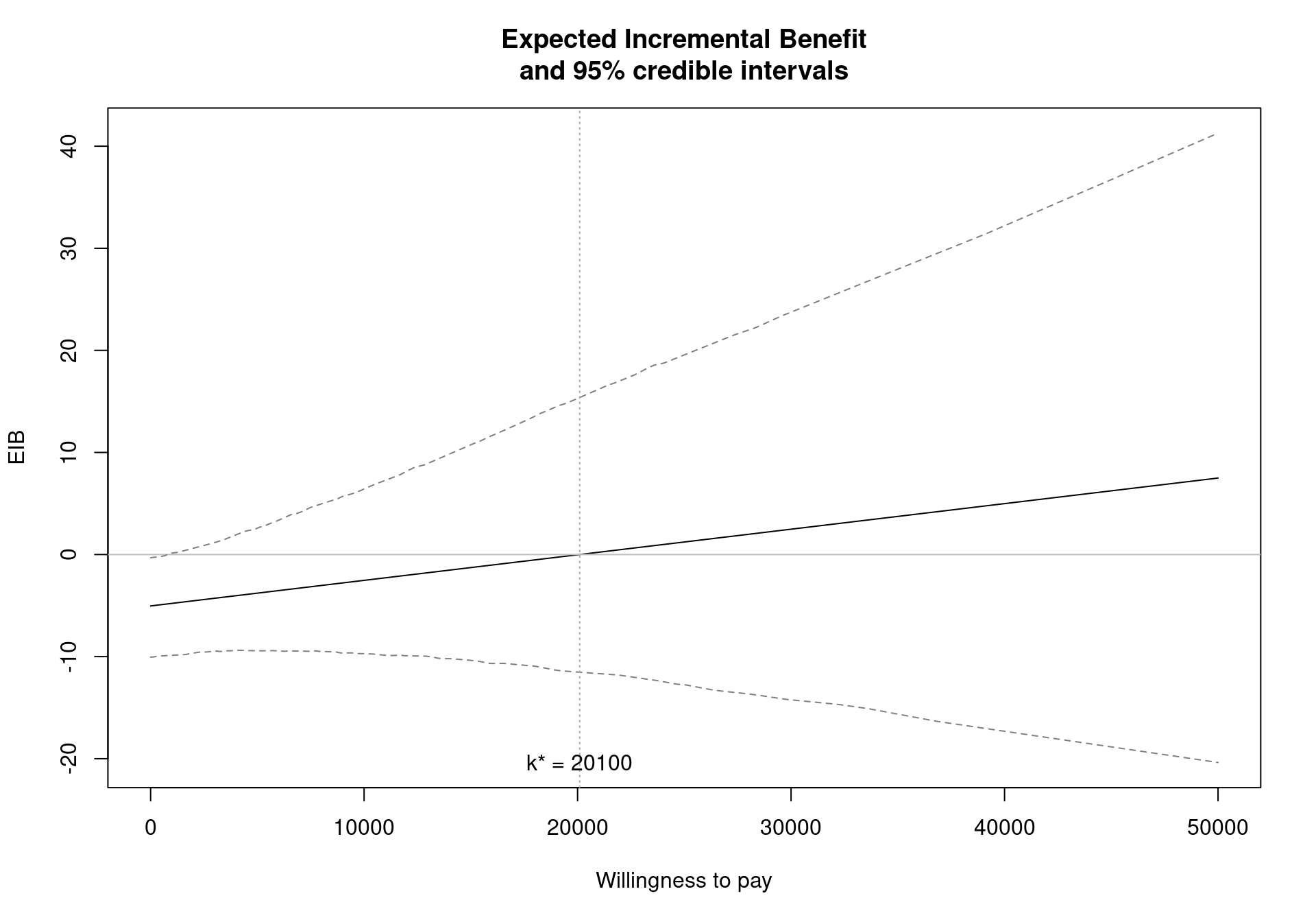
The function eib.plot plots by default all the available comparisons. Optionally a specific subset of comparisons to be represented can be selected. This can be done assigning to the argument comparison a vector with numeric values indexing the comparisons to be included as elements. For example if the BCEA object contains multiple interventions, the option comparison=2 will produce the EIB plot for the second non-reference comparator versus the reference one, sorted by the order of appearance in the matrices \(e\) and \(c\) given to the BCEA object. The break-event points (if any) can be excluded from the plot by setting the argument size=NA. However controlling the label size via the size argument is possible only in the ggplot2 version of the plot (see below).
The pos option is used only when multiple comparisons are available. In this case a legend allowing the user to identify the different comparisons is added to the plot, and can be positioned as in the ceplane.plot function. The values "top", "bottom", "right" or "left" or a combination of two of them (\(e.g.\) "topright") will position the label in the respective position inside the plot area. For example the code,
eib.plot(m, pos="topleft")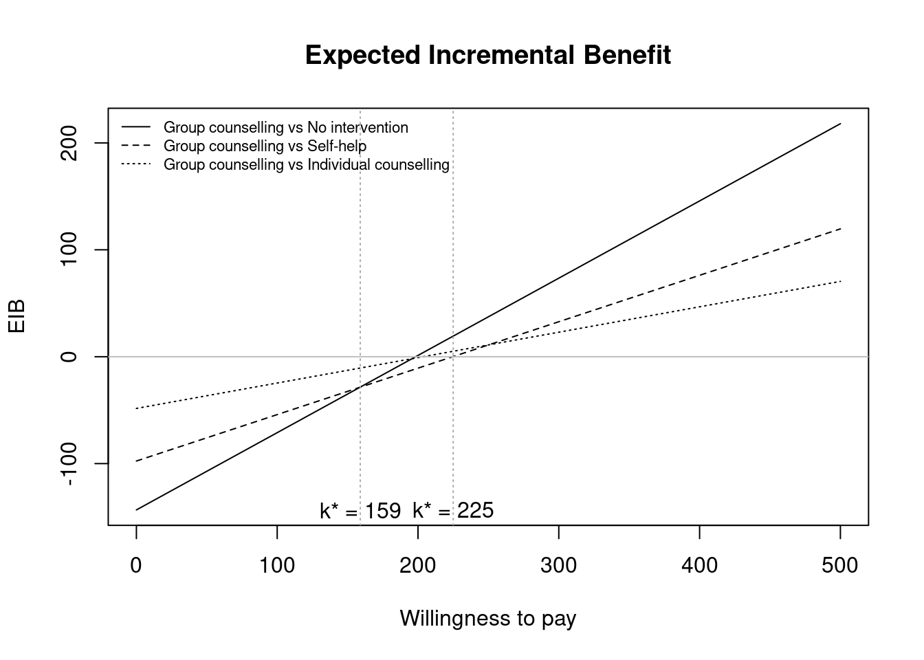
where m is the BCEA object for the Smoking example, produces Figure 3.11. The parameter pos can be specified also in the form of a two-element numeric vector. The value 0 in the first position indicates the left of the plot, while 0 in the second position will place the label on the bottom of the plot. A numeric value different than 0 (\(e.g.\) equal to 1) will refer to the right or top, respectively if in the first or second position of the vector.
Notice that in Figure 3.10 two additional lines give the credible intervals for the EIB, whereas for the multiple comparisons the credible intervals are not given. The argument plot.cri controls these credible intervals and is set to NULL by default. This means that if a single comparison is available or selected, the eib.plot function also draws the 95% credible interval of the distribution of the incremental benefit. The intervals are not drawn by default if multiple comparisons are selected. However, they can be included in the graph by setting the parameter plot.cri=TRUE. In addition, the interval level can be set using the alpha argument, default value \(0.05\), implying that the 95% credible interval is drawn.
If plot.cri=TRUE, the function will calculate the credible intervals at level 1-alpha. The credible intervals are estimated by default by calculating the \(2.5-\)th and \(97.5-\)th percentiles of the IB distribution. Alternatively they can be estimated using a normal approximation by setting cri.quantile=FALSE. This alternative method assumes normality in the distribution of the incremental benefit and thus, for each value \(k\) of the grid approximation of the willingness to pay, the credible intervals are estimated as \[
\mbox{EIB} \pm z_{\alpha/2} \sqrt{\mbox{Var} \left( \mbox{IB}(\pmb\theta) \right)},
\] where \(z_{\alpha/2}\) indicates the quantile of the standard normal distribution.
The available options for ggplot2 versions of the IB and EIB plot do not differ from the base functions. The only difference is that in the eib.plot function the size of the break-even point labels can be changed using the argument size, giving the size of the text in millimetres. The ggplot2 versions can be produced by setting the parameter graph="ggplot2" (or graph="g", using partial matching) in both ib.plot and eib.plot function calls.
3.6 Contour plots
Contour plots are used to extend the amount of graphical information given by the representation of the simulated outcomes on the cost-effectiveness plane. The BCEA package implements two different tools to compare the joint distribution of the outcomes, the functions contour4 and contour2. The contour function is an alternative representation of the cost-effectiveness plane with respect to ceplane.plot. While the latter focuses on the distributional average (\(i.e.\) the ICER), contour gives a graphical overview of the dispersion of the cloud of points representing the simulations, displaying information about the uncertainty associated with the outcomes.
The contour function can be invoked with the following code, which will produce the plot in Figure 3.12:
contour(m)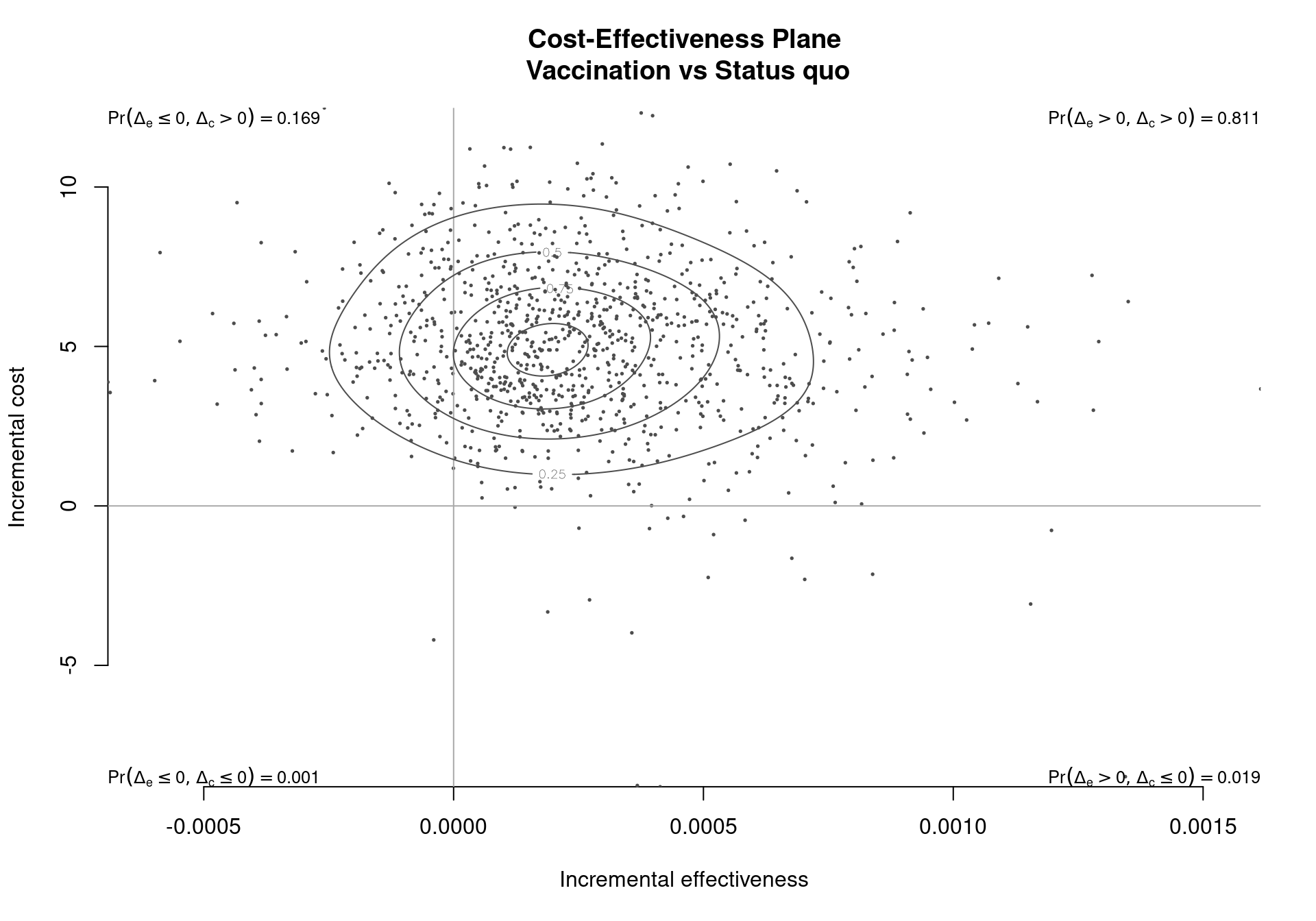
contour.bcea. The contour lines give a representation of the variability of the distribution and of the relationship between the two outcomes. The four labels at the corners of the plot indicate the proportion of simulations falling in each quadrant of the Cartesian plane.
The function plots the outcomes of the simulation on the cost-effectiveness plane, including a contour indicating the different density levels of the joint distribution of the differentials of costs and effectiveness. The contour lines divide the observed bivariate distribution of the outcome \((\Delta_e, \Delta_c)\) in a pre-specified number of areas. Each contour line is a curve along which the estimated probability distribution function has a constant value. For example, if the chosen number of contour lines is four, the distribution will be divided in five areas each containing \(20\%\) of all simulated outcomes. A larger number of simulations will determine a more precise estimation of the variance and therefore of the contours of the distribution. By default the function partitions the Cartesian plane in 5 regions, each associated with an equal estimated density of probability with respect to the bivariate distribution of the differential outcomes.
If a single comparison is available or selected, the comparison argument is a single-element vector, the graph indicates the probability of a point (\(i.e.\), the outcome of a future simulation) falling in each of the four quadrants of the cost-effectiveness plane. The probability that the status quo dominates the alternative treatment is equal to the likelihood of a future outcome landing in the north-western quadrant. Alternatively, while the probability of the alternative treatment dominating is the probability of residing in the south eastern quadrant. For example, Figure 3.12 shows the basic results for the Vaccine example; the estimated probability of the vaccination strategy dominating is 0.019, while the probability of the status quo dominating is 0.169.
Several options are available for the contour function. Again, the parameter comparison determines which comparison should be plotted in a multi-decision setting. The base graphic version produces only a single comparison per plot, therefore for multi-comparison models this argument must be used. If the comparison argument is not passed then the first comparison is plotted by default. Multiple comparisons can be plotted at the same time by choosing the ggplot2 version of the plot.
The scale argument can be used the change the density of the contours. Internally BCEA calculates the contours using a bivariate kernel density kde2d which is based on an argument h, giving the density between each contour. This is passed as h \(=\left(\frac{\hat{\sigma}_e}{\mathtt{scale}}; \frac{\hat{\sigma}_c}{\mathtt{scale}} \right)\), where \(\hat{\sigma}_e\) and \(\hat{\sigma}_c\) are the standard deviations for the effectiveness and costs respectively. Therefore, increasing the scale gives tighter contours.
The option nlevels indicates the number of areas to be included on the graphic, \(i.e.\) Figure 3.12 has 5 levels. However, as this parameter is highly dependent on the value of h sometimes the true number of levels can differ from nlevels. The argument levels on the other hand allows the manual specification of a vector of values at which to draw the contour lines. The number of levels will then be equal to the length of the vector.
Due to the S3 nature of the function contour, the help page for the usage within BCEA can be accessed by the command help(contour.bcea) or alternatively by ?contour.bcea.
The ggplot2 version of the contour.bcea function is capable of plotting multiple comparisons at the same time. It is possible to represent different pairwise comparisons in the same plot by setting the parameter comparison to a vector of the chosen comparisons.
contour(m, graph="ggplot2", comparison=c(1,3))For multiple comparisons, a legend to identify the different comparisons will be included and its position can be adjusted using the pos argument. Again it can be set outside the plot with the four options "bottom", "top", "left" or "right". Alternatively, it is possible to put the legend inside the plot using a two-element vector as in the ceplane.plot function (see Section 3.4). Note that, the argument pos is only used in the ggplot2 version of the graph, as it is only used for multiple comparisons.
The contour2 function includes the contour of the bivariate distribution as well as decision-making elements (\(i.e.\) the ICER and the cost-effectiveness acceptability region). The plot in Figure 3.13 is produced by the following code:
contour2(m)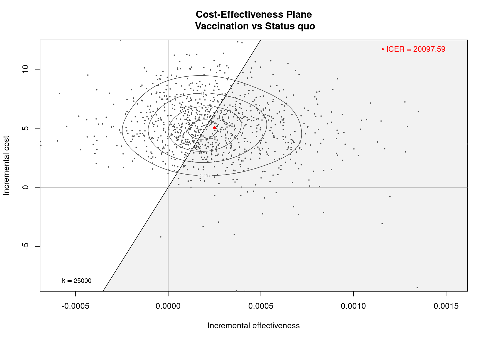
contour2. This function differs from contour.bcea since it includes decisional elements such as the cost-effectiveness acceptability region. In this example it can be seen that the mean of the distribution is not exactly centred, since the mean is driven by the simulations resulting in a high effectiveness differential between the two strategies. This results in a difference between the mean and median of the distribution.
The parameters which can be set in the contour2 function are:
wtp, the value of the willingness to pay threshold involved in the decision;comparison, indicating which comparison should be included in the plot (or comparisons, ifggplot2is used);xlandyl, which can be used to set the limits on the \(x\)- and \(y\)-axis respectively by assigning them a two-dimensional vector.
A clear representation of the cost-effectiveness plane for multiple comparisons can be produced by using the ggplot2 version of the contour2 function. This represents the outcomes of the simulations on the plane, together with the contours of the distributions and the cost-effectiveness acceptability region. The plot in Figure 3.14 can be produced by the following command:
contour2(m, graph="ggplot2", comparison=NULL, wtp=250, pos=TRUE, ICER_size=2)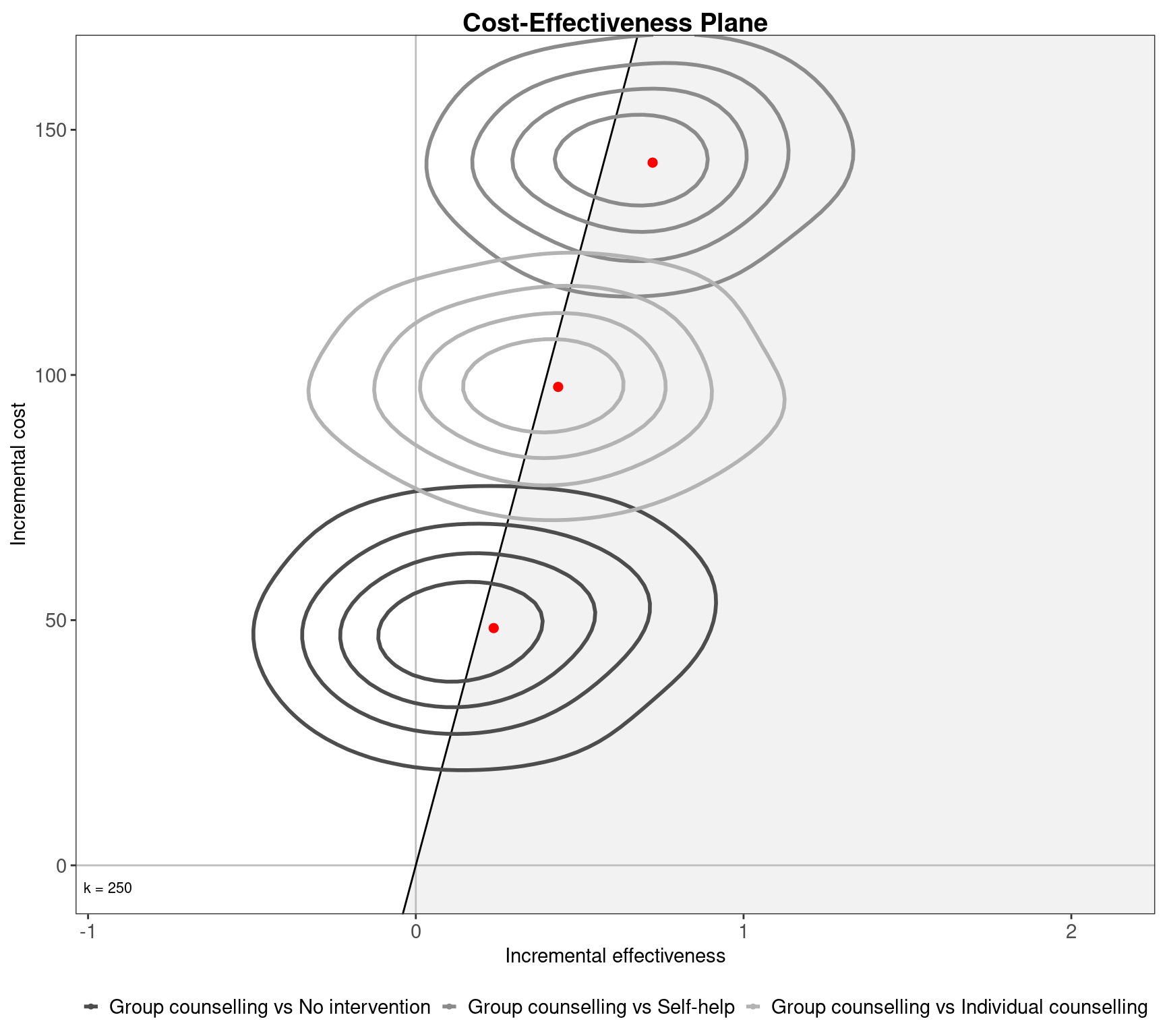
Clearly, this Figure is similar to Figure 3.6, with the additional of the bivariate contours allowing the user to identify the variation in the different comparisons more clearly. Evidently, this version of the contour2 function is able to pass additional values to the ceplane.plot function (\(e.g.\), the arguments pos, ICER_size, label.pos). In addition, both contour and contour2 can be further customised using the same optional arguments that have been described in Section 3.4.3 (that is irrespective of which graphical engine is used to produce the graph).
3.7 Health economic evaluation for multiple comparators and the efficiency frontier
There are several ways of looking at the respective cost-effectiveness between comparators in an analysis of multiple comparisons. The most common graphical tool for this evaluation is the cost-effectiveness plane. However the comparative evaluation can be executed using another graphical instrument, the cost-effectiveness efficiency frontier. The efficiency frontier is an extension of the standard approach of incremental cost-effectiveness ratios and provides information for the health economic evaluation when a universal willingness to pay threshold is not employed (\(e.g.\) Germany) and it is particularly informative for assessing maximum reimbursement prices (Institute for Quality and Efficiency in Health Care (IQWiG), 2009).
The efficiency frontier compares the net costs and benefits of different interventions in a therapeutic area. It is different from the common differential approach (\(e.g.\) the cost-effectiveness plane) as the net measures are used. The predicted costs and effectiveness for the interventions under consideration are compared directly to the costs and effectiveness measure for treatments that are currently available. The frontier itself defines the set of interventions for which cost is at an acceptable level for the benefits given by the treatment. A new treatment would be deemed efficient — \(i.e.\) it would then lie on the efficiency frontier – if, either, the average effectiveness for the new treatment is greater than any of the currently available treatments or, the cost of the treatment is lower than currently available treatments with the same effectiveness. This area for efficiency lies to the right of the curve in Figure 3.15.
Practically, efficiency is determined sequentially. This means that we start from an arbitrary inefficient point (\(i.e.\) the origins of the axes) and then determine the intervention with the smallest average effectiveness. In general, this intervention will also have a higher cost than the starting point — this intervention will also have the lowest ICER value amongst the comparators. If two ICERs are equal then the treatment with the lowest cost is deemed to be efficient, \(i.e.\) lie on the efficiency frontier. The next intervention included on the frontier then has the next lowest effectiveness and cost measures — \(i.e.\) has the lowest ICER value compared to the current efficient intervention. This method proceeds until all efficient technologies have been identified.
The BCEA function ceef.plot produces a graphical and optionally a tabular output of the efficiency frontier, both single and multiple comparisons. Given a bcea object m, the frontier can be produced simply by the ceef.plot(m) command. In the plot, the circles indicate the mean for the cost and effectiveness distributions for each treatment option. The number in each circle corresponds to the order of the treatments in the legend. If the number is black then the intervention is on the efficiency frontier. Grey numbers indicate dominated treatments. By default, the function presents the efficiency frontier plot in Figure 3.15 and a summary, as displayed below:
ceef.plot(m, pos="topright", start.from.origins=FALSE)
Cost-effectiveness efficiency frontier summary

Interventions on the efficiency frontier:
                  Effectiveness   Costs Increase slope Increase angle
No intervention         0.41051   0.000           0.00         0.0000
Self-help               0.69875  45.733         158.66         1.5645
Group counselling       1.13303 143.301         224.67         1.5663

Interventions not on the efficiency frontier:
                       Effectiveness  Costs     Dominance type
Individual counselling       0.89536 94.919 Extended dominance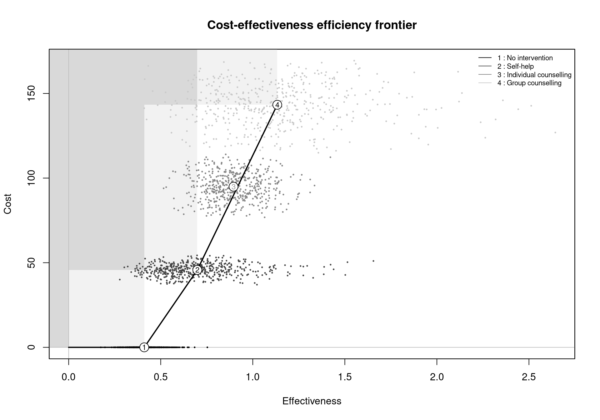
ceef.plot function. The colours of the numbers in the circles indicate if a comparator is included on the efficiency frontier or not. In this case, the interventions No treatment, Self-help and Group counselling are on the frontier. Individual counselling is extendedly dominated by Self-help and Group counselling.
The text summary is produced by setting the argument print.summary to TRUE (the default) and can be suppressed by giving it the value FALSE. The summary is composed of two tables, reporting information for the comparators included on the frontier. It also details the average health effects and costs for the comparators not on the frontier, if any. For the interventions included on the frontier, the slope of the frontier segment connecting the intervention to the previous efficient one and the angle inclination of the segment (with respect to the \(x-\)axis), measured in radians, are also reported. In particular, the slope can be interpreted as the increase in costs for an additional unit in effectiveness, \(i.e.\) the ICER for the comparison against the previous treatment. For example, the ICER for the comparison between Self-help and No treatment is £\(176.01\) per life year gained.
The dominance type for comparators not on the efficiency frontier is reported in the output table. This can be of two types: absolute or extended dominance. An intervention is absolutely dominated if another comparator has both lower costs and greater health benefits, \(i.e.\) the ICER for at least one pairwise comparison is negative. Comparators in a situation of extended dominance are not wholly inefficient, but are dominated because a combination of two other interventions will provide more benefits for lower costs. For example, in the Smoking example, a combination of Group Counselling and Self-Help would give more benefits for the same cost as Individual Counselling.
The plot produced by the ceef.plot function, displayed in Figure 3.15, is composed of different elements:
- the outcomes of the simulations, \(i.e.\) the matrices
effandcostprovided to thebceafunction, represented by the scatter points, with different colours for the comparators; - the average cost and effectiveness point for each comparator considered in the analysis. These are represented by the circles including numbers indexing the interventions by their order of appearance in the
bceaobject. The legend provides information on the labels of the comparators; - the efficiency frontier line, connecting the interventions on the frontier;
- the dominance regions, shaded in grey. A lighter shade indicates that interventions in that area would be (absolutely) dominated by a single intervention, while multiple interventions would dominate comparators in the area with the darker shade. Comparators in the non-shaded areas between the dominance regions and the efficiency frontier are extended dominated. The graphical representation of the dominance areas can be suppressed by setting
dominance=FALSEin the function call.
The start.from.origins option is used to choose the starting point of the frontier. By default its value is set to TRUE, meaning that the efficiency frontier will have the origins of the axes, \(i.e.\) the point \((0,0)\) as starting point. If this is set to FALSE, the starting point will be the average outcomes of the least effective and costly option among the compared interventions. If any of the comparators result in negative costs or benefits, the argument start.from.origins will be set to FALSE with a warning message. The starting point will not be included in the summary if not in correspondence of the average outcomes of one of the included interventions.
As German guidelines recommend representing the costs on the \(x\) axis and benefits on the \(y\) axis, an option to invert the axes has been included (Institute for Quality and Efficiency in Health Care (IQWiG), 2009). This can be done by specifying flip=TRUE in the function call. It is worth noting that, in the efficiency frontier summary, the angle of increase of the segments in the frontier will reflect this axes inversion. However, the segment slopes will not change, to retain consistency with the definition of ICER (additional cost per gain in benefit).
The function allows any subset of the comparators to be included in the estimation of the efficiency frontier. The interventions to be included in the analysis can be selected by assigning a numeric vector of at least two elements to the argument comparators, with the indexes of the comparators as elements. For example, to include only the first and third comparator in the efficiency frontier for the smoking cessation analysis, it is sufficient to add comparators=c(1,3) to the efficiency frontier function call. Additionally, the positioning of the legend can be changed from the default (\(i.e.\) in the top-right corner of the graph) by modifying the value assigned to the argument pos. The values that can be assigned to this argument are consistent to the other plotting functions in BCEA, \(e.g.\) ceplane.plot and eib.plot.
The ggplot2 version of the graph shares the design with the base graphics version. In addition to the higher flexibility in the legend positioning provided by the argument pos, a named theme element can be included in the function call, which will be added to the ggplot2 object. The dominance regions are also rendered in a slightly different way, with levels of transparency stacking up when multiple comparators define a common dominance area. As such, the darkness of the grey-shaded areas depend on the number of comparators sharing absolute dominance areas.
References
Baio, G., 2020. survHE: survival analysis for health economic evaluation and cost-effectiveness modeling. Journal of Statistical Software 95, 1–47.
Baio, G., 2012. Bayesian Methods in Health Economics. Chapman Hall/CRC Press, Boca Raton, FL.
Baio, G., Berardi, A., 2013. BCEA: A package for Bayesian Cost-Effectiveness Analysis.
Baio, G., Heath, A., 2016. When Simple Becomes Complicated: Why Excel Should Lose Its Place at the Top Table. Global & Regional Health Technology Assessment 4, e3–e6. https://doi.org/10.5301/grhta.5000247
Baio, G., Thom, H., Pechivanoglou, P., 2025. R for Health Technology Assessment. Chapman; Hall/CRC.
Chang, W., Cheng, J., Allaire, J., Xie, Y., McPherson, J., 2015. Shiny: Web application framework for r.
Incerti, D., Jansen, J.P., 2021. hesim: Health Economic Simulation Modeling and Decision Analysis.
Incerti, D., Thom, H., Baio, G., Jansen, J., 2019. R You Still Using Excel? Why We Need Modern Software Tools for Health Technology Assessment. Value in Health 22, 575–579.
Institute for Quality and Efficiency in Health Care (IQWiG), 2009. General methods for the assessment of the relation of benefits to costs.
Jackson, C., 2023. Survextrap: A package for flexible and transparent survival extrapolation. BMC Medical Research Methodology 23, 282.
Jackson, C., Heath, A., 2024. voi: Expected Value of Information.
Jalal, H., Pechlivanoglou, P., Krijkamp, E., Alarid-Escudero, F., Enns, E., Hunink, M.M., 2017. An overview of r in health decision sciences. Medical decision making 37, 735–746.
Sievert, C., 2020. Interactive web-based data visualization with r, plotly, and shiny. Chapman; Hall/CRC.
Wickham, H., 2009. ggplot2: Elegant Graphics for Data Analysis (Use R!) . Springer.
Wickham, H., Averick, M., Bryan, J., Chang, W., McGowan, L.D., François, R., Grolemund, G., Hayes, A., Henry, L., Hester, J., Kuhn, M., Pedersen, T.L., Miller, E., Bache, S.M., Müller, K., Ooms, J., Robinson, D., Seidel, D.P., Spinu, V., Takahashi, K., Vaughan, D., Wilke, C., Woo, K., Yutani, H., 2019. Welcome to the tidyverse. Journal of Open Source Software 4, 1686. https://doi.org/10.21105/joss.01686
Wilkinson, L., Wills, D., Rope, D., Norton, A., Dubbs, R., 2013. The grammar of graphics, Statistics and computing. Springer New York.
Williams, C., Lewsey, J., Briggs, A., Mackay, D., 2016. Cost-effectiveness analysis in r using a multi-state modeling survival analysis framework: A tutorial. https://doi.org/10.1177/0272989X16651869
Processing the data as demonstrated in Section 2.3.2 will yield slightly different results than those presented in this section as the parameters were produced in two different simulations. The following analyses are based on the
Vaccinedataset included in theBCEApackage.↩︎This choice is due to the fact that the average threshold of cost-effectiveness commonly used by NICE (National Institute for Health and Care Excellence) varies between £20,000 and £30,000 per QALY gained.↩︎
The default theme in the
BCEAplots is an adaptation oftheme_bw().↩︎The
contour.bceafunction is anS3method forBCEAobjects, thus it can be invoked by calling the functioncontourand giving a validbceaobject as input.↩︎